Where do you stop when you're on the move? Love them or loathe them, service stations are a lifeline for commuters, HGV drivers and holiday makers in search of a toilet and caffeine hit.
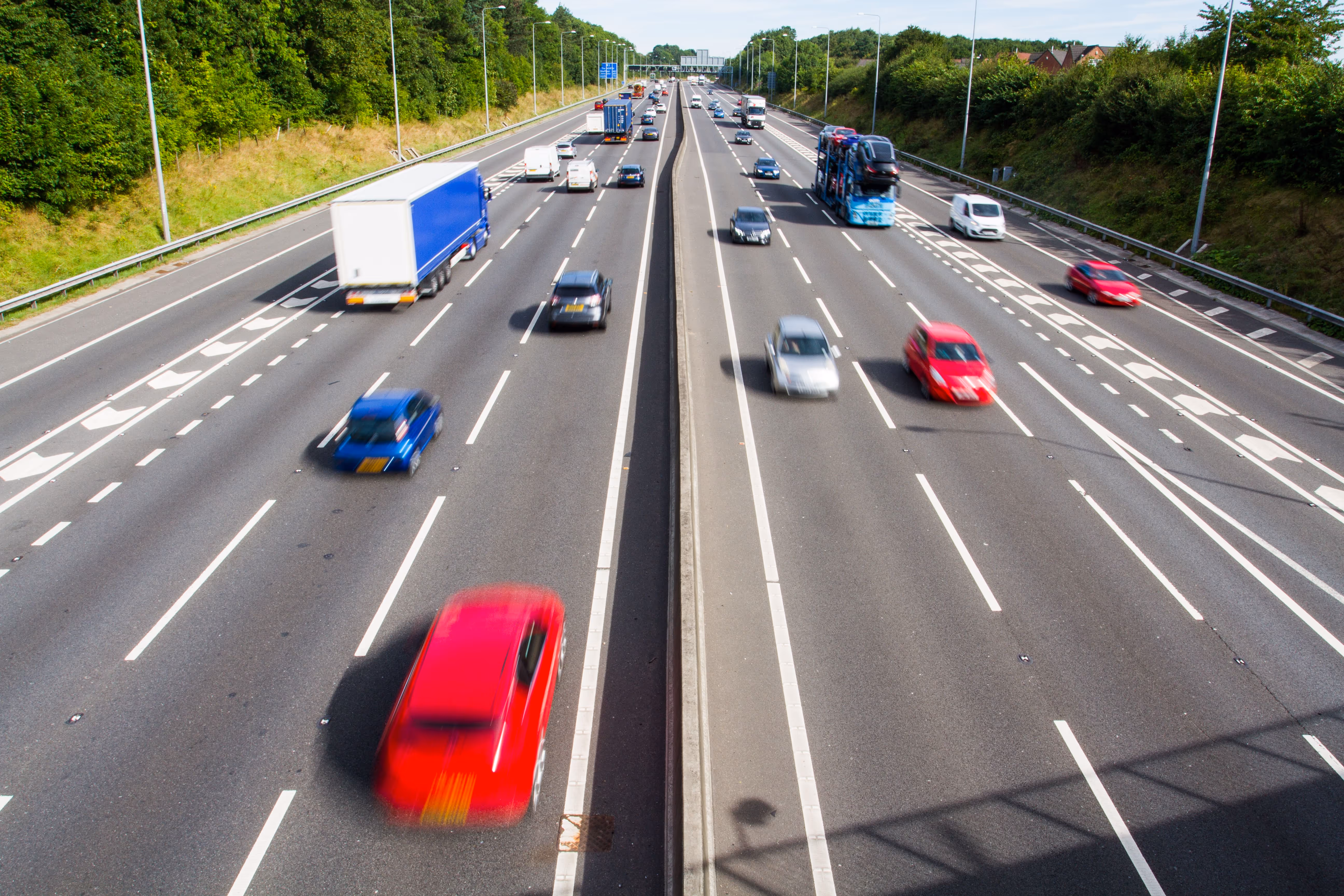
But while most people only spend 15–20 minutes at motorway services, there’s still a high potential for conflict (in a navigational sense) to arise in this most complex of environments.
These are places where multiple user needs collide – and this could be literally, if you’re not careful. So when we’re asked to create a wayfinding strategy for service stations, we’re not just designing signs. We’re designing for speed, safety and clarity in a space where everyone’s moving at different paces, and with different priorities.
Here’s what makes wayfinding at service stations uniquely challenging – and how we help make it all run more smoothly.
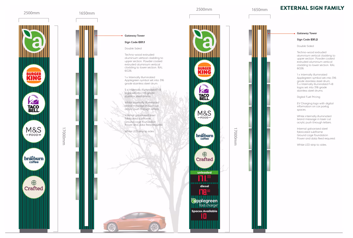
At Dunshaughlin, we designed a 17 metres tall totem sign – possibly our tallest ever. But it’s not just big for the sake of it. It’s a landmark and a call to action.
Why so tall? Because your first challenge is getting people to notice the service station in good time before they fly past it. Visibility is critical, especially when your user is in the fast lane doing 70.
That means positioning signage so it’s visible from a distance, to give users time to change lanes safely and reach the slip road intime.
And once they’re off the motorway?
You’ve still got to help them make the right decisions at speed. Drivers don’t arrive calm and collected, but tired and hungry, and they need telling where to go, quickly.
Wayfinding strategies for services stations are founded on a clear understanding of user journeys so we map out vehicle routes and decision points for cars, HGVs and coaches, and instil a logical information hierarchy, so that the right signage steers people in the right direction from the moment they leave the carriageway.
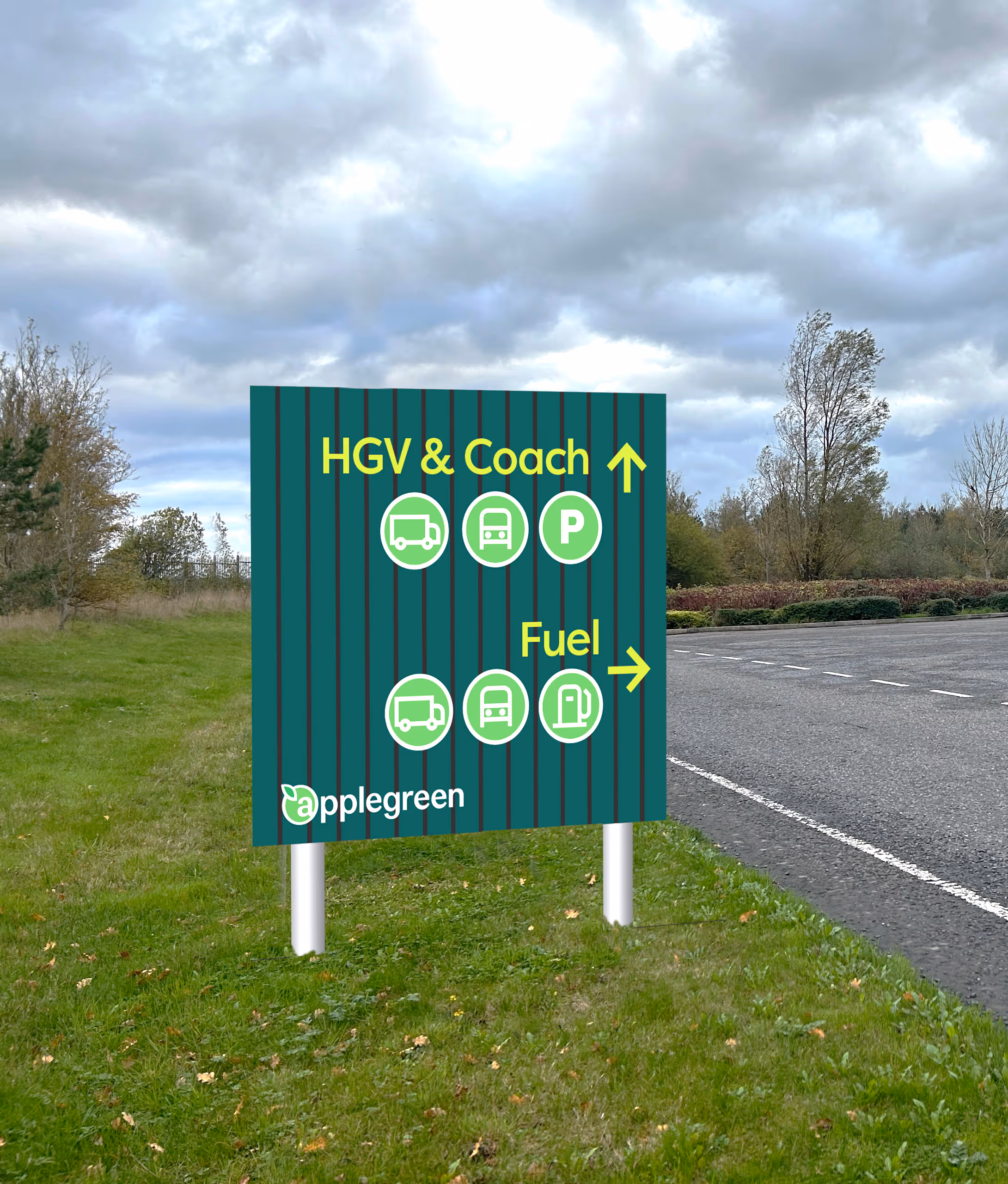
And we use iconography wherever possible to reinforce important messages intuitively, reducing cognitive load and helping users make decisions more quickly. It’s a technique that also helps to establish brand awareness and personality across a site, beyond language.
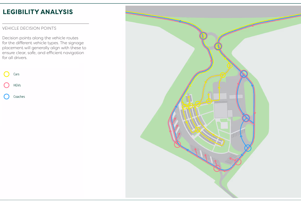
Service stations are small sites with big traffic. Cars, lorries, coaches and pedestrians all have somewhere to go, and inevitably need to cross each other’s paths. It’s an environment that’s ripe for confusion and conflict, especially as drivers often continue to drive like they’re still on the motorway.
That’s why designing for safety is the key factor in all our service station strategies. Clear routes, consistent markings and visual cues help get people from car to coffee without wandering across an HGV lane.
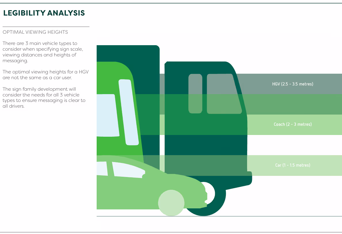
Our strategy takes into account optimal viewing heights and distances for the three main vehicle types to use the services, to make sure that critical information guiding people to safety is seen from their eye level– whether that’s from an HGV driver’s seat, a car or on foot.
A well-crafted wayfinding journey is more than just signs. It’s an integrated experience that enables everyone to navigate confidently and comfortably.
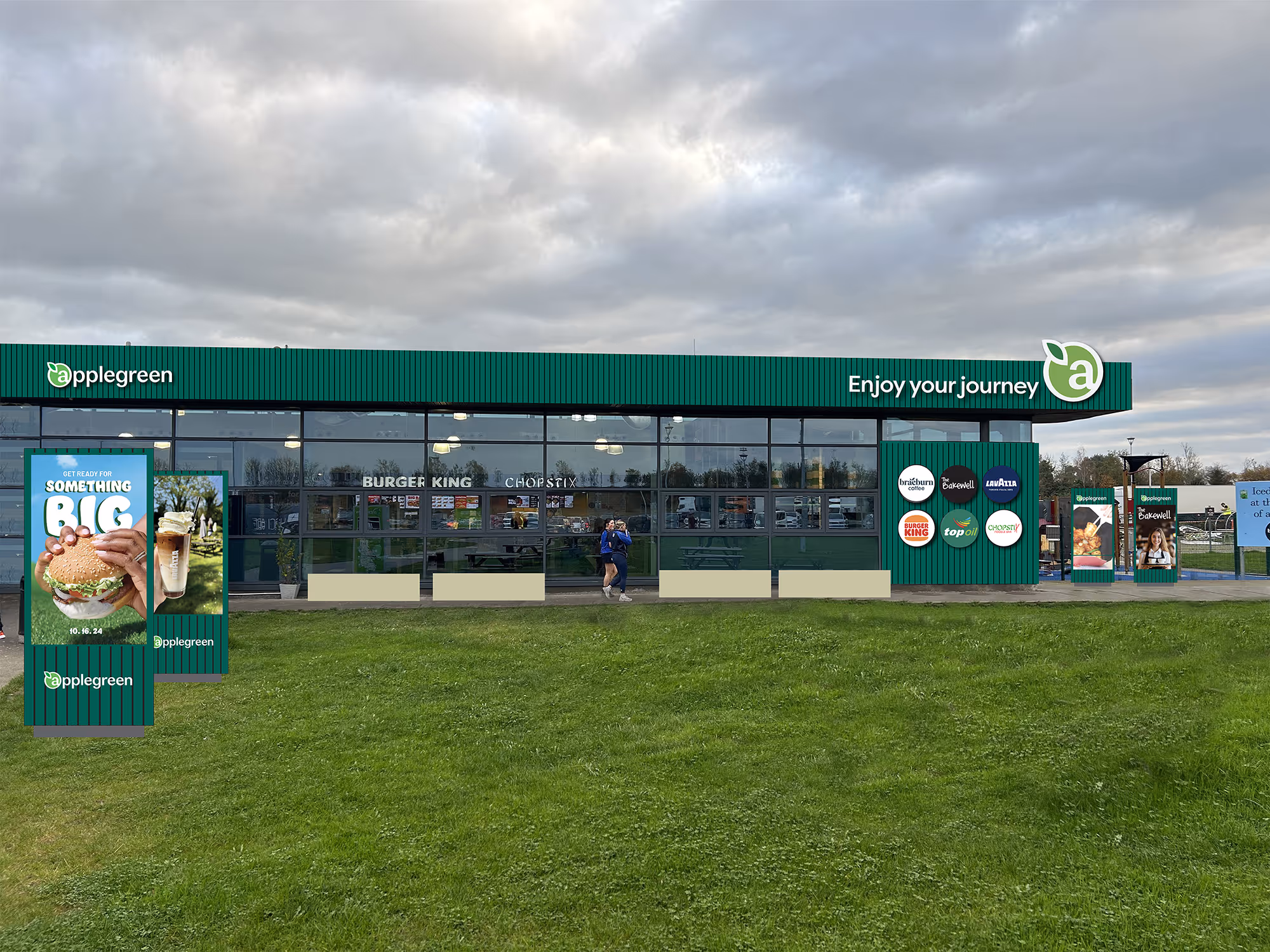
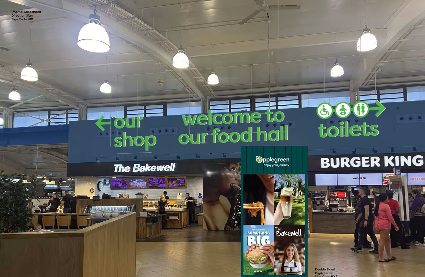
Most modern service stations are shared buildings, occupied by multiple food, drink and retail brands – each with its own signage, colour palette and messaging – all jostling for your attention. It’s easy for food and retail halls to bombard visitors with wall-to-wall brand messages.
Our job is to bring order to chaos. We create clear brand hierarchies to help visitors find what they’re looking for quickly. The service station provider itself should always be the most prominent brand, directing users to parking, entrances and toilets etc, but it’s also important to integrate and showcase the fuel, retail and food offer, too.
At Applegreen in Ireland, we established clear brand guidelines so that its own branded signage is always at least 1.5 times larger than third-party logos. And to avoid visual overwhelm, we developed a hanging sign system for directional signage, suspending individual letters from the ceiling. That helps to visually separate the site-wide branding from third-party brands.
It’s much more than an eye-catching design or even well-thought-out messaging, though both of these are critical.
It’s about understanding behaviour and desire lines, instilling clarity and sharing the right information at the right time. A good wayfinding strategy at a service station is one that:
That’s how to make navigation feel easy – even when it’s not. We may not be able to fix the traffic you get stuck in, but we can make your pit stop a little less painful.
If you're planning a new roadside development or want help bringing calm to a chaotic service station, get in touch. We’ll help you see things from a user’s perspective – no matter how fast they’re moving.