Trinity College Dublin’s brutalist-style Arts Building dates from the 1970s and was well overdue a facelift.
Working with architect McCrossan O’Rourke & Manning, who was leading on the building’s internal fit out, our challenge was to bring a clearer sense of navigation to this inherently gloomy and labyrinthine building.
Sign information was outdated and, worse still, some signs had become obscured with clutter such as vending machines.
After our initial work at Trinity’s new business school, we were tasked with auditing the Art Building’s existing signage to understand what wasn’t working and what was missing.
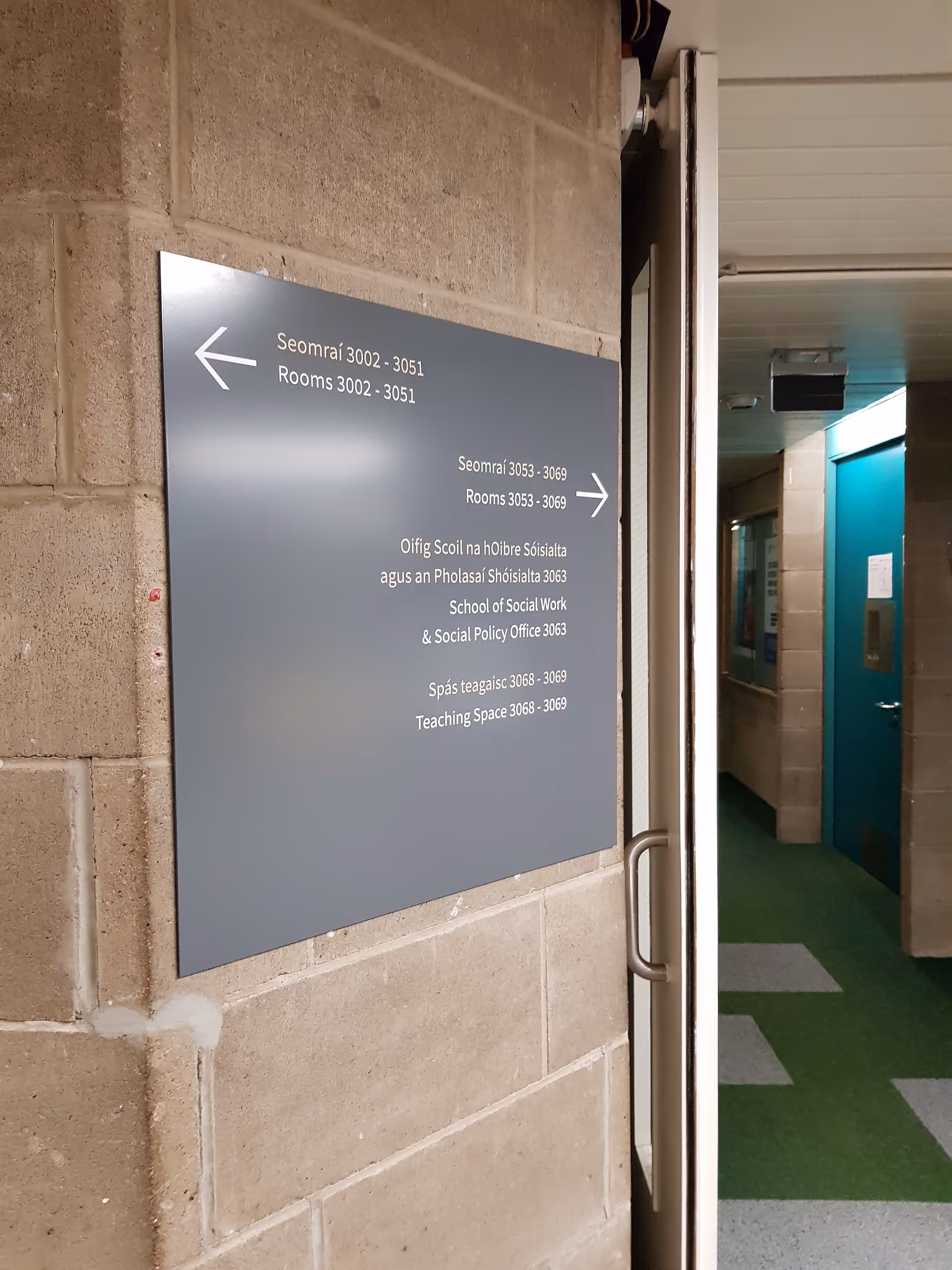
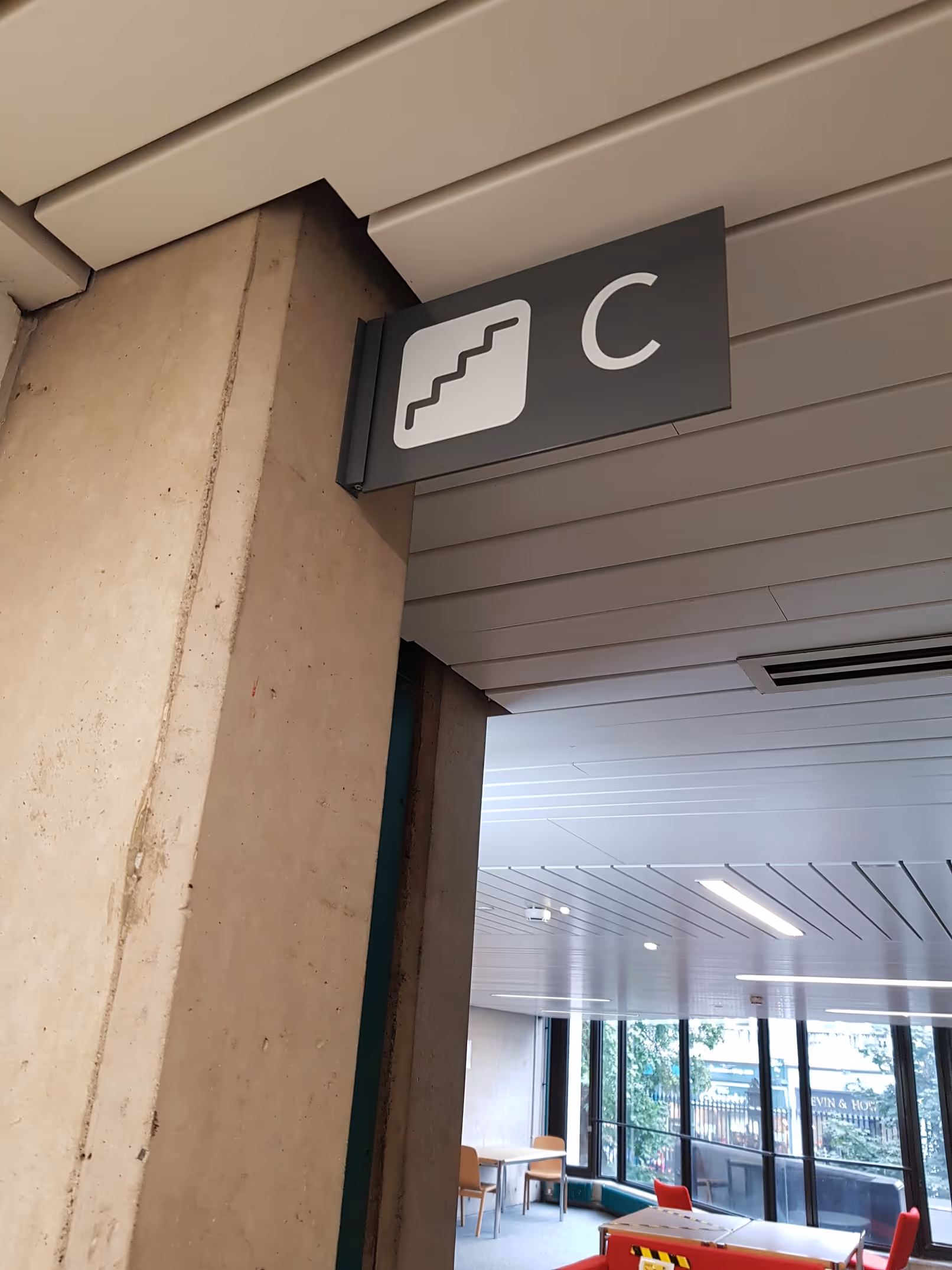
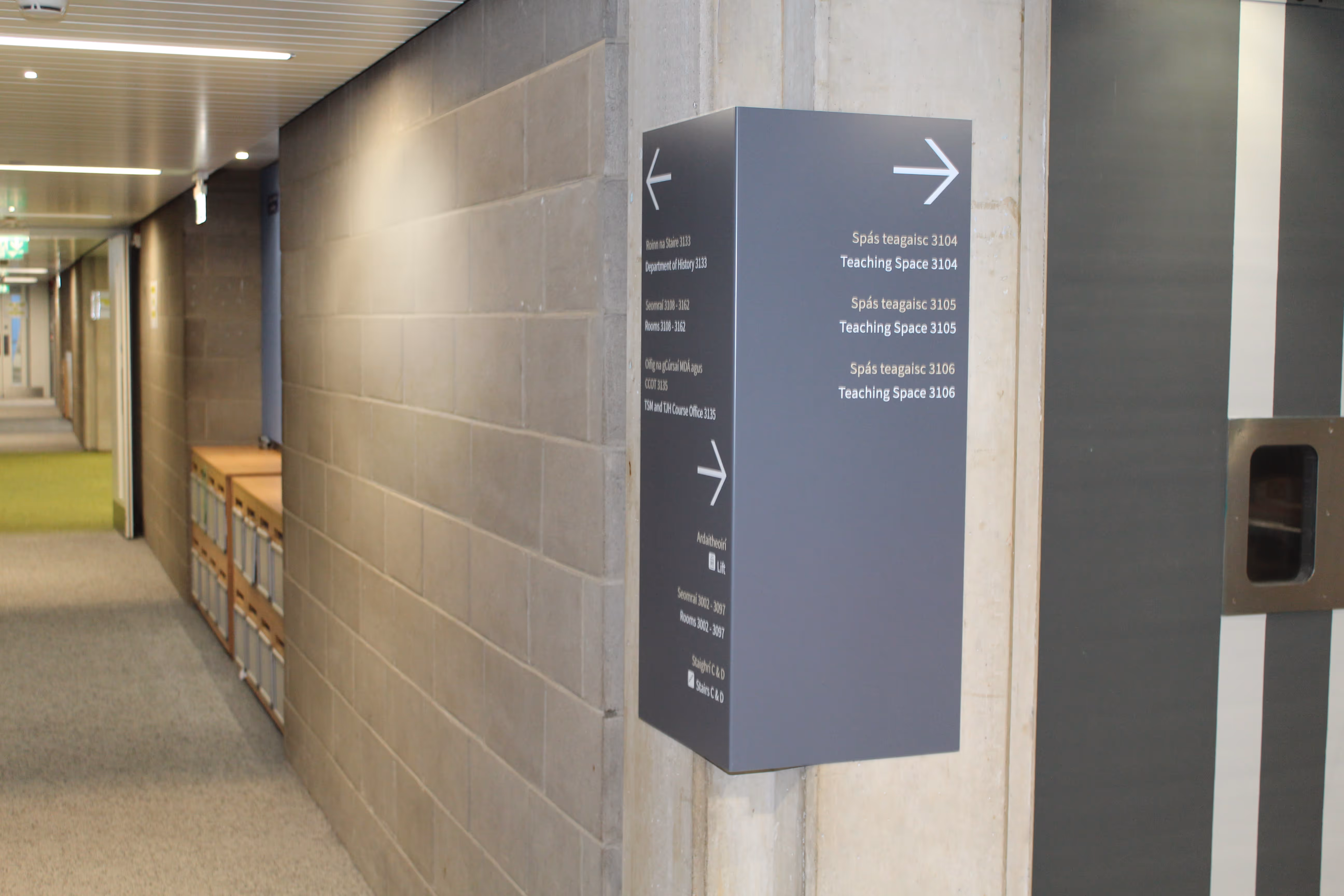
The building layout comprises long main corridors with secondary corridors leading to rooms. Our strategy was to design signage that answered this inherent wayfinding problem. So, we designed signs that turned corners and could be seen from both directions. Our sign family also included wall directories and flag signs, picking up key decision-making points such as stair cores.
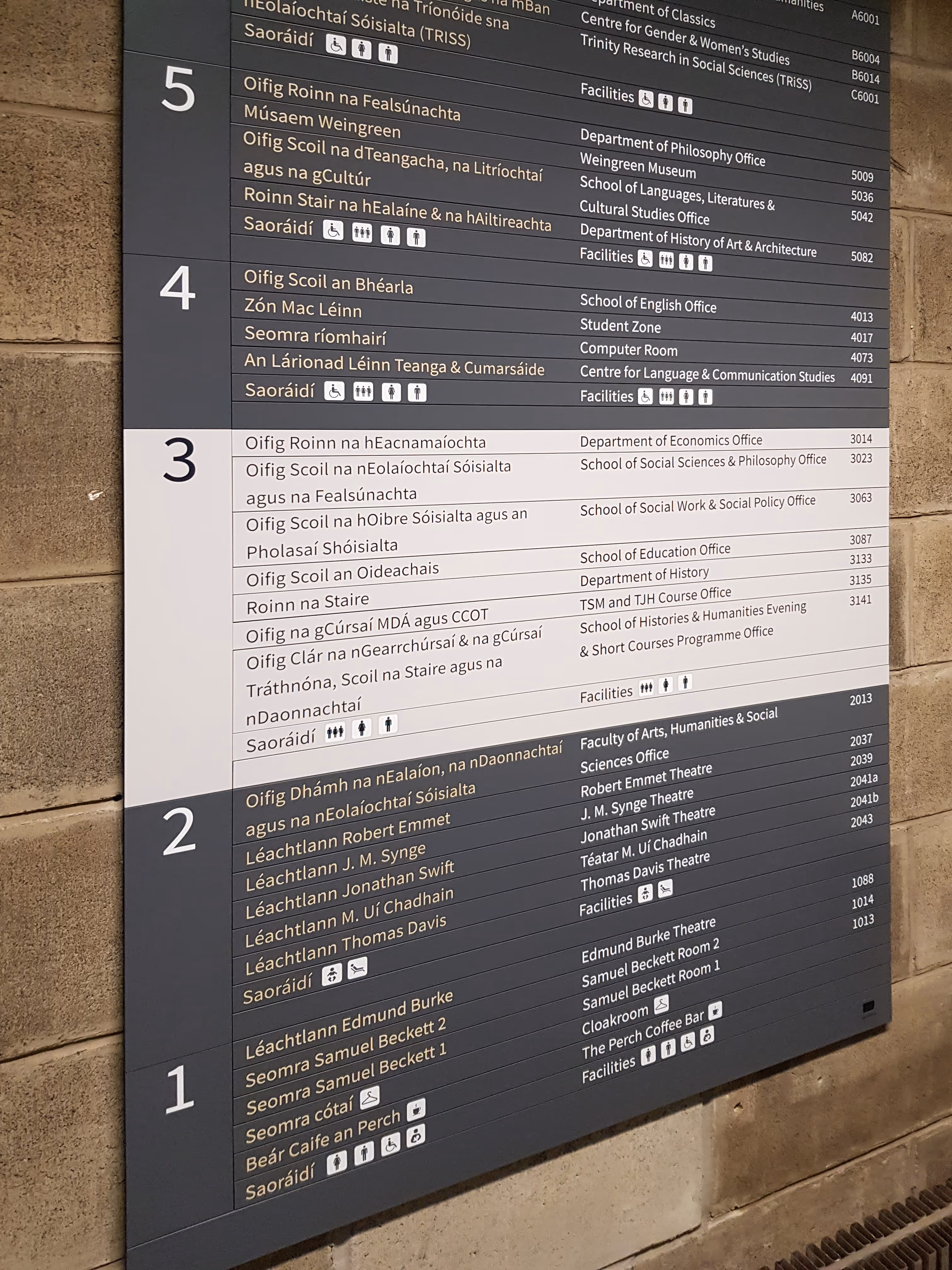
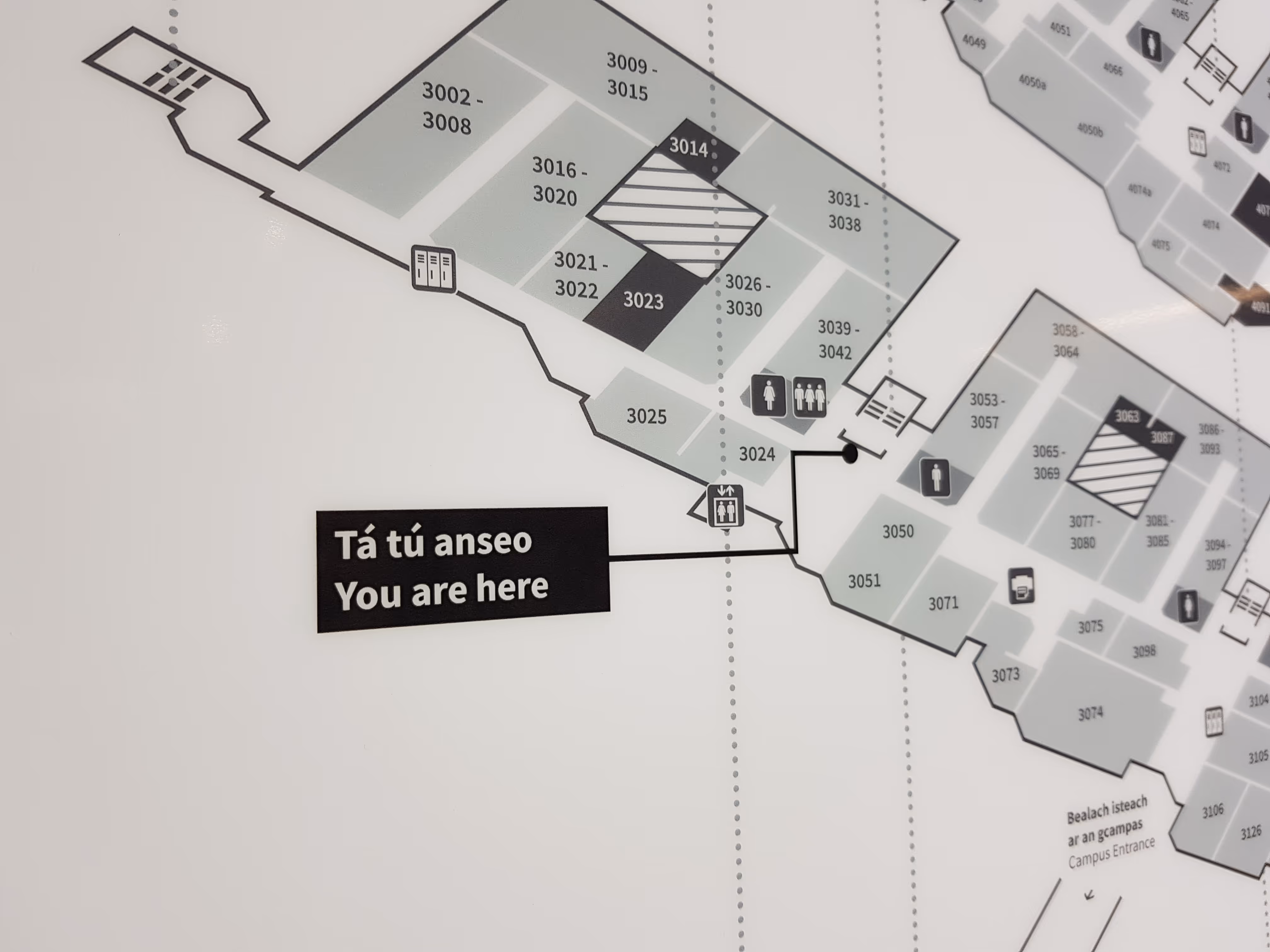
We created a stacked map for the floor directories, with stair cores and key spaces highlighted. These were on light boxes, helping ease navigation in naturally gloomy spaces. Flag signs helped reinforce stair cores, we introduced a slatted system to help with future updates, and we incorporated Irish into all signs.
Directional signs turn corners, so users can see where to go next, whichever direction they approach from. Icons negate the need for words where possible, and light boxes shed light on where users are, while simultaneously providing an accent in gloomy conditions.
Dual language signs were originally designed with English in white and Irish in beige because, in 2019, English was the more dominant language. Interestingly, now that there are more Irish-speaking students, our later phases have reversed this colour rule, to make the Irish wording more dominant on signs.