
Travelling to other places offers something unique – the power of fresh eyes. As a visitor, you see things for the first time, for better or worse.
Sue’s recently been travelling more for leisure, experiencing new places not as a designer, but as a visitor. On a recent trip to South East Asia, she stuck to her usual mantra – let the local signage guide the way – and resisted the pull of her phone and Google Maps where possible. Why? It’s one of the best ways to understand how a place presents itself to newcomers.
Of course, old habits die hard. Even on holiday, it’s difficult to switch off when your work is also something you care deeply about. And seeing a place through that lens is, in many ways, the ultimate test of its legibility and navigability.
When Sue began designing wayfinding in the late 1990s, a common theme would repeatedly rear its head.
Clients and developers were keen to roll out “safe”, off-the-shelf designs intended to blend into heritage settings – what became known as “catalogue heritage”.
In reality, though, these designs merely repeated the same visual language from place to place, saying little about the specific identity of each location and missing the opportunity to enhance its special historic character.
From the beginning, our mantra at Placemarque was always to offer something better, something unique.
We argued that wayfinding does far more than point someone in the right direction, it helps interpret the story of a place and reflect its character. And for that, you always need bespoke signage.
Wayfinding interventions become a point of engagement, helping visitors understand where they are while gently guiding them through what’s on offer.
Fast forward to today, and while the conversation has moved on, the same pattern is beginning to re-emerge in a new form.
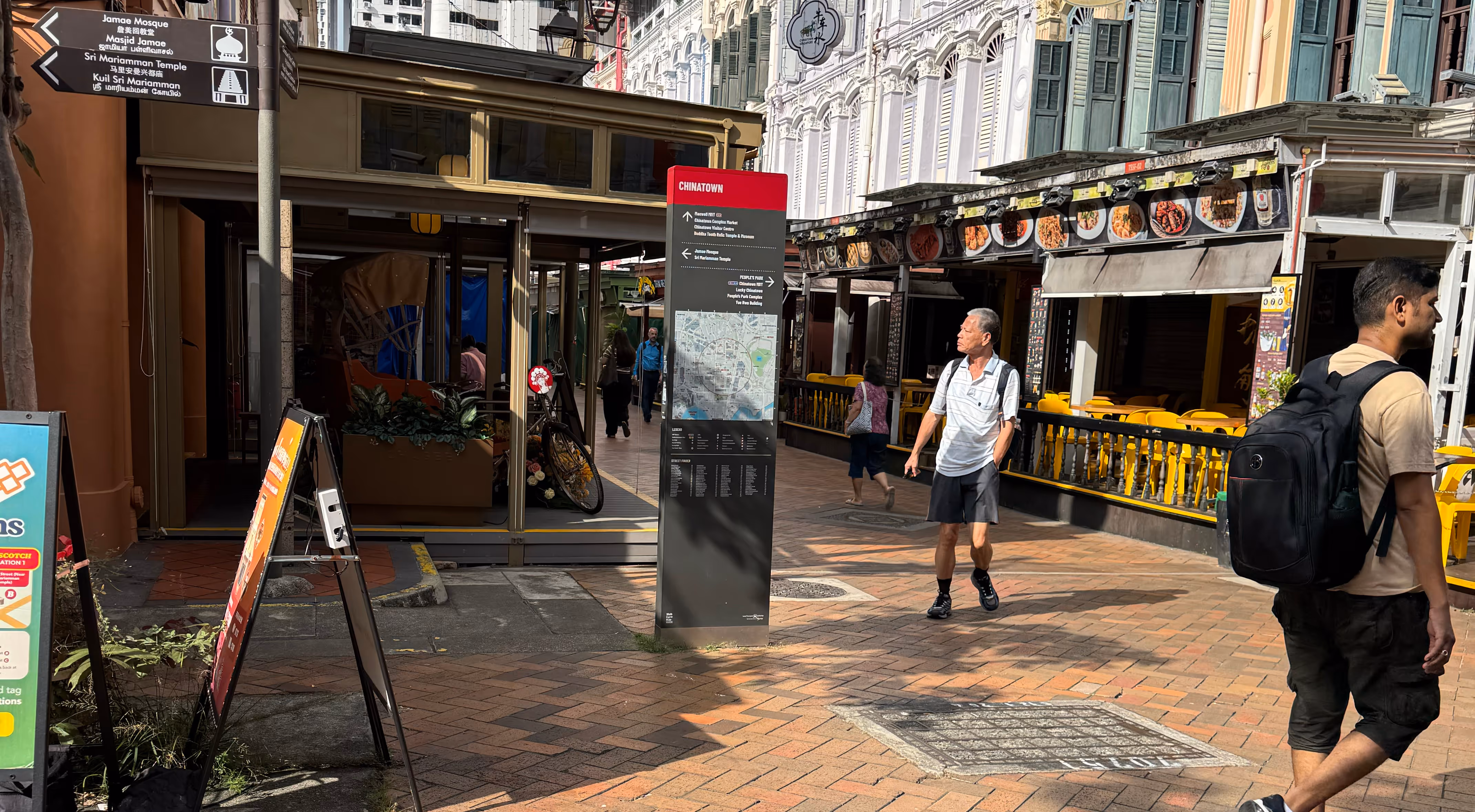
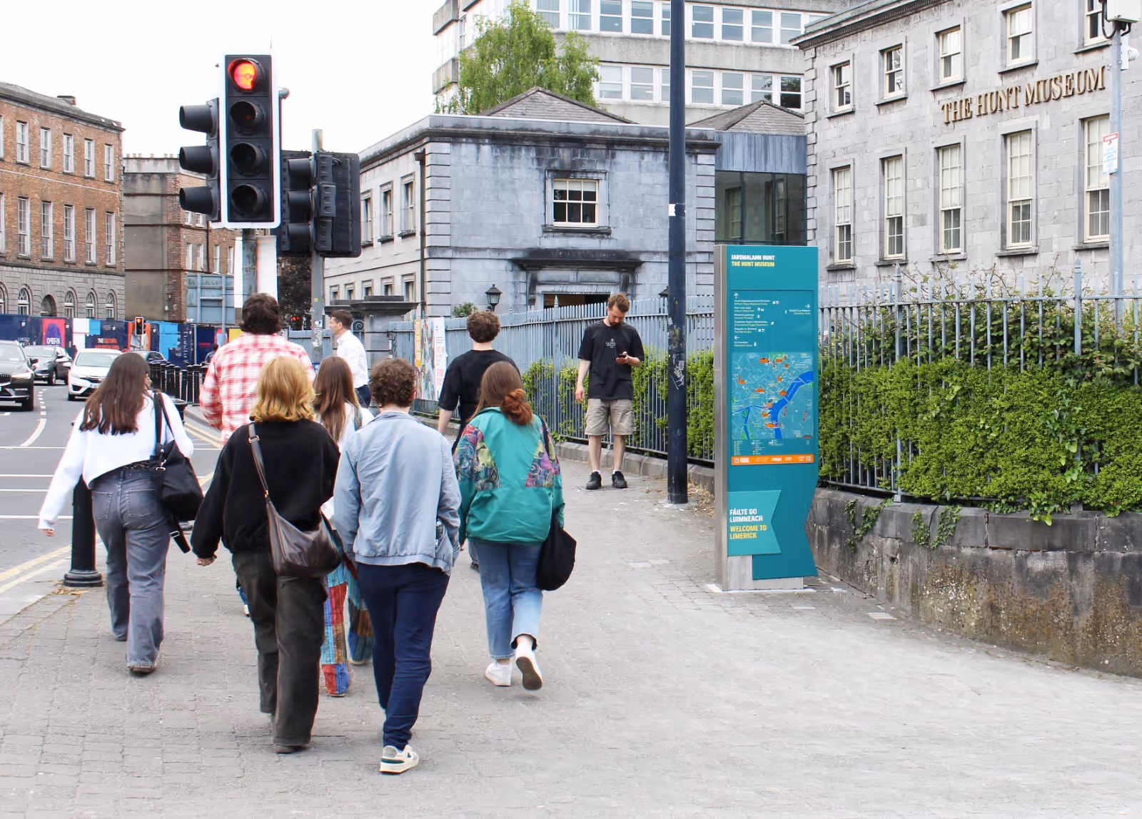
Today, we see a much wider understanding of what a wayfinding system should include. Map monoliths, fingerposts and reinforcing markers are now part of the standard toolkit. That in itself is progress.
But increasingly, those elements are starting to look the same wherever you go.
The same monolith formats. The same graphic approaches. Often with little connection to the place they sit within.
And, just as importantly, the fundamentals aren’t always right - maps that aren’t heads-up, text that isn’t legible, layouts that don’t help users build a clear mental map of a place.
In many cases, the industry has simply swapped “catalogue heritage” for what might be described as “catalogue contemporary”.
There are several reasons behind this shift.
Despite the role it plays in how people experience a place, it can still be brought in late in the process, once key decisions about movement and identity have already been made.
When decisions are driven by precedent rather than purpose, it becomes tempting to replicate what’s been done elsewhere without fully understanding why it works – and whether it will work in a different place.
When budgets tighten, bespoke elements and design detail are often the first things to be stripped back. What remains may be functional, but rarely adds anything meaningful to the experience of a place.
The result is wayfinding that does the minimum, rather than making the most of the opportunity.
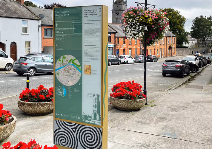
Every place has its own DNA. The challenge is to first understand it, and then to express it.
At Limerick, Placemarque’s award-winning wayfinding strategy was rooted in the city’s identity. The system helped visitors understand and connect with the city, helping them build a mental map of the city and attractions in the wider region. At the Ray Dolby Centre in Cambridge, our approach responded to a very different context: a highly specialised academic environment in a bespoke building.
Yet in both cases, the principles were consistent:
And, of course, getting the fundamentals right is key. Heads-up mapping. Clear hierarchies to help people understand complex spaces. Signs positioned at key decision points. These aren’t off-the-shelf decisions. They require expertise and a considered approach.
Wayfinding is often one of the first interactions a visitor has with a place. It shapes first impressions and can either build confidence or create confusion.
When it’s treated as a standardised product, rather than a bespoke response, it becomes a missed opportunity.
But when it’s done well, it does far more than guide people from A to B. It helps them understand where they are and what makes that place distinctive, giving them the confidence to stay a little longer and walk a little further.
And that’s why getting the wayfinding right still matters.
