Accessibility and inclusivity are our top design priorities across all our projects. And yet, fresh from our recent attendance at the Neuroplaces Expo at Shoreditch Design Week, we’ve come away with a fresh appreciation and deeper understanding about the impact that genuinely accessible signage can have on a person’s experience of place.
It’s the difference between someone finding their way to an important job interview or missing it.
Or the difference between a new student feeling at home quickly or all at sea.
Across the built environment accessibility is a fundamental aspect of design, with accessibility standards and best practice intended to inform every stage of the design process. Yet it’s still too often treated as an afterthought.
Beyond these important considerations, truly accessible places help buildings and public spaces function better, too, making visitors feel welcome and encouraging people to return.
Fired up by our time exhibiting alongside long-standing partners Wood + Wood, we’re sharing our top tips on how to ensure signage and interpretation design can go the extra mile to ensuring accessibility for all.
Icons are a valuable tool to reduce the amount of text needed to convey information. They should always be universally recognised, appropriately sized and oriented, and consistent across a suite of signs.
Solid icons work better than outlined icons for legibility, helping to boost contrast, and the simpler the better, always.
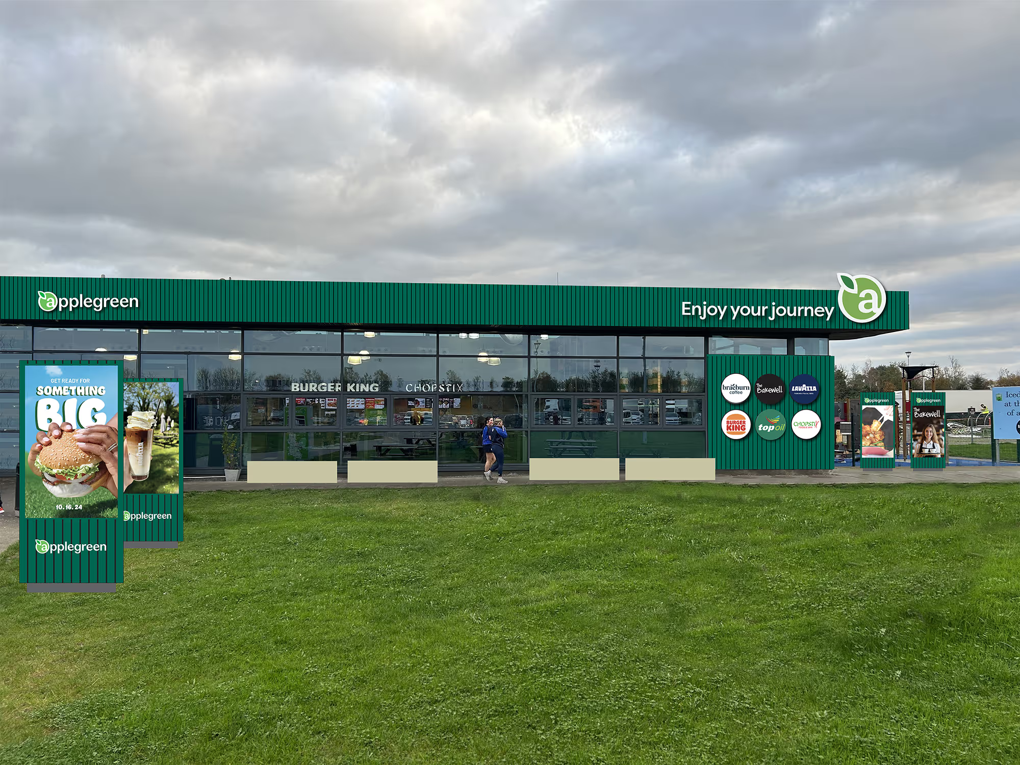
Our work for motorway service provider Applegreen in Lusk and Dunshaughlin incorporated simple, clear to understand icons to help users navigate what would otherwise be a very complex, and unfamiliar environment.
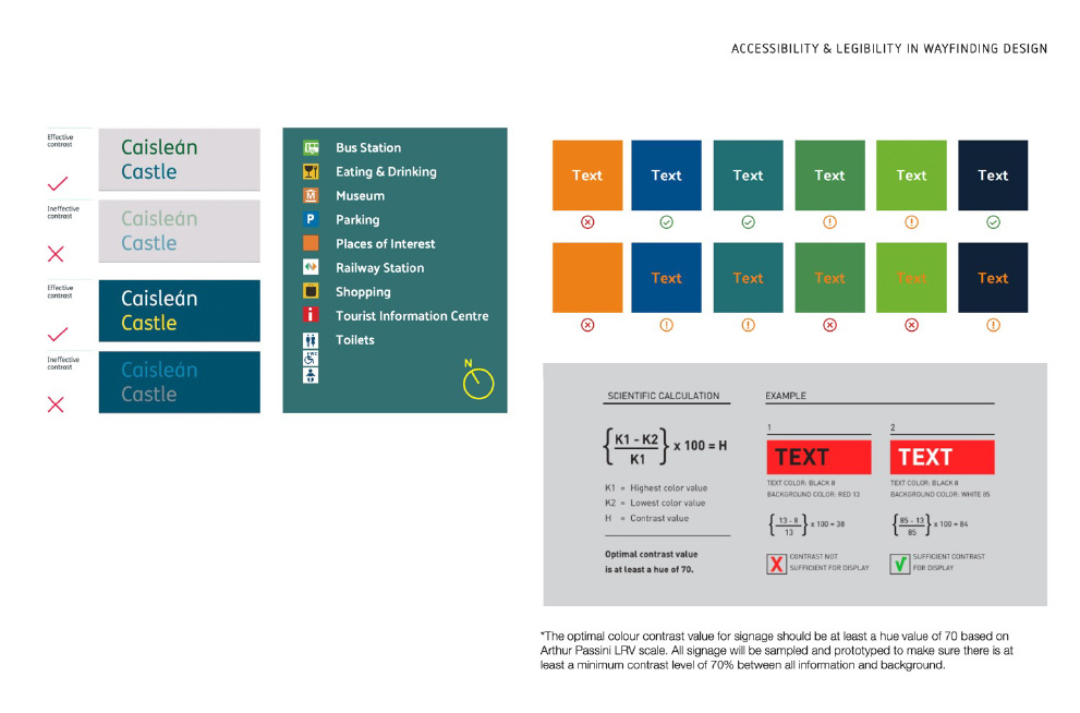
The success of wayfinding relies on a person’s ability to easily recognise and read a sign, and colour contrast is a key element of this. Low contrasts are a no-no because they’re simply too difficult to distinguish for anyone with a visual impairment. Lesser contrasts can sometimes be acceptable for large text, but the gold standard is a sign with a good contrast between itself and the background, content and icons.
This is where understanding accessibility is so important when visual brands concepts are explored and developed so that sign design can faithfully represent brands while remaining totally accessible to the public.
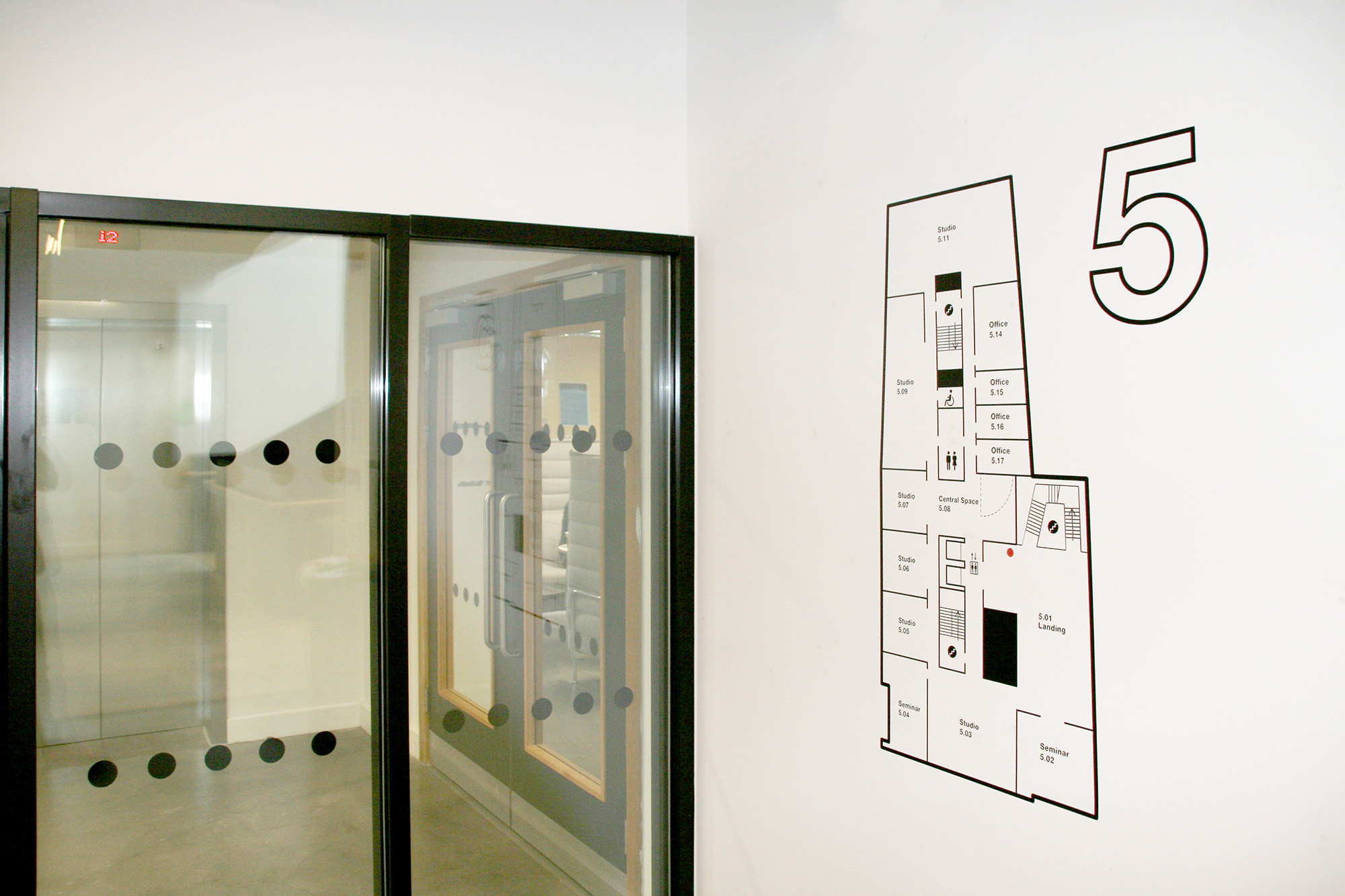
Mapping matters for accessibility because it lets people orientate themselves before they even arrive, an important step for visitors with anxiety, dementia or processing differences, for whom unpredictability can be genuinely disorientating.
Reinforcing the same map visual within the environment helps someone trying to find their way.
Maps don’t need to show every door, or even every room: diagrammatic maps help simplify the amount of information being conveyed to that which is needed for orientation and navigation, without overwhelming the user.
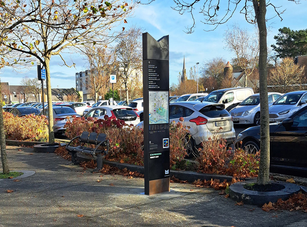
The NaviLens app helps blind and partially-sighted people access information via colour-coded markers, scannable from several metres away. The app then reads the information aloud. Our work in Tralee, Ireland incorporated NaviLens technology to help users access audible directional information.
Its colour distinguishes it from the commonplace QR codes, helping users identify them from further away.
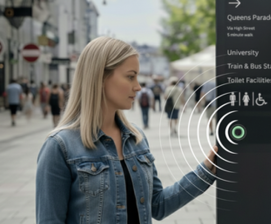
Another technology we're investigating for future projects is Omnie Vox, which provides audio directional information, powered by AI.
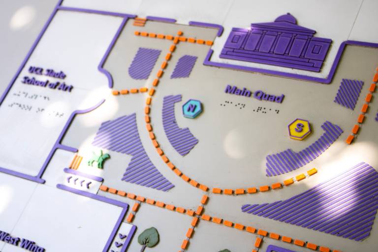
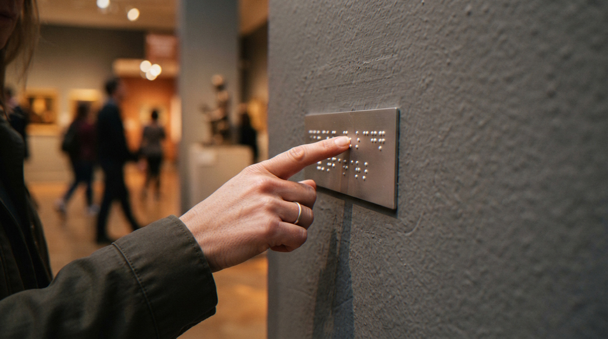
Tactile and braille mapping supports blind and partially-sighted people through touch. We designed a tactile map for UCL’s Wilkins Building, which presented buildings, paths and ramps as raised, textured shapes with braille and embossed labels marking key locations.
Colour contrasts and directional markers also help, giving users an explorable overview of a space before they embark on the next step of their journey.
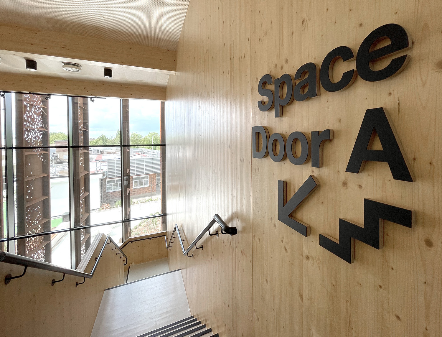
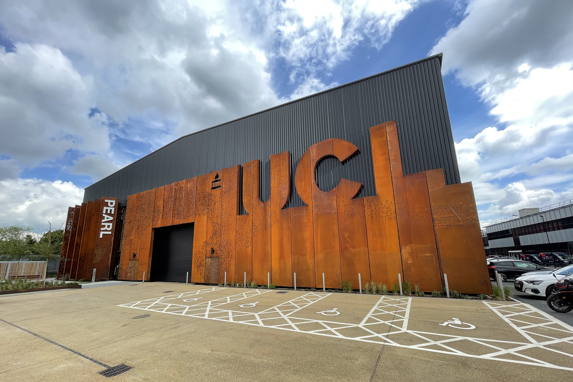
Signage can also be tactile, supporting accessible wayfinding through raised lettering, bold type and strong contrasts that are either readable by touch or at close range. At UCL Pearl, we adopted this approach, pairing large icons with text to identify stairs, lifts and toilets, empowering users to navigate the building independently and confidently.
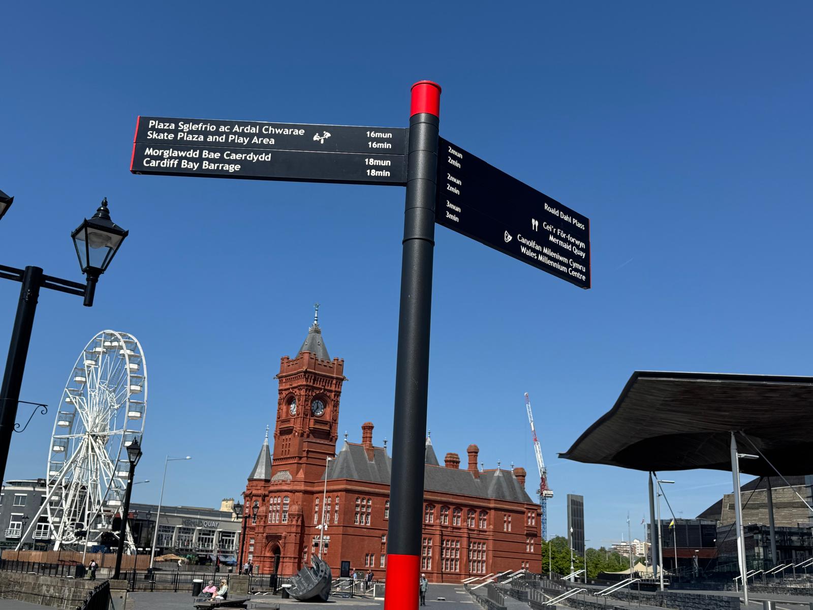
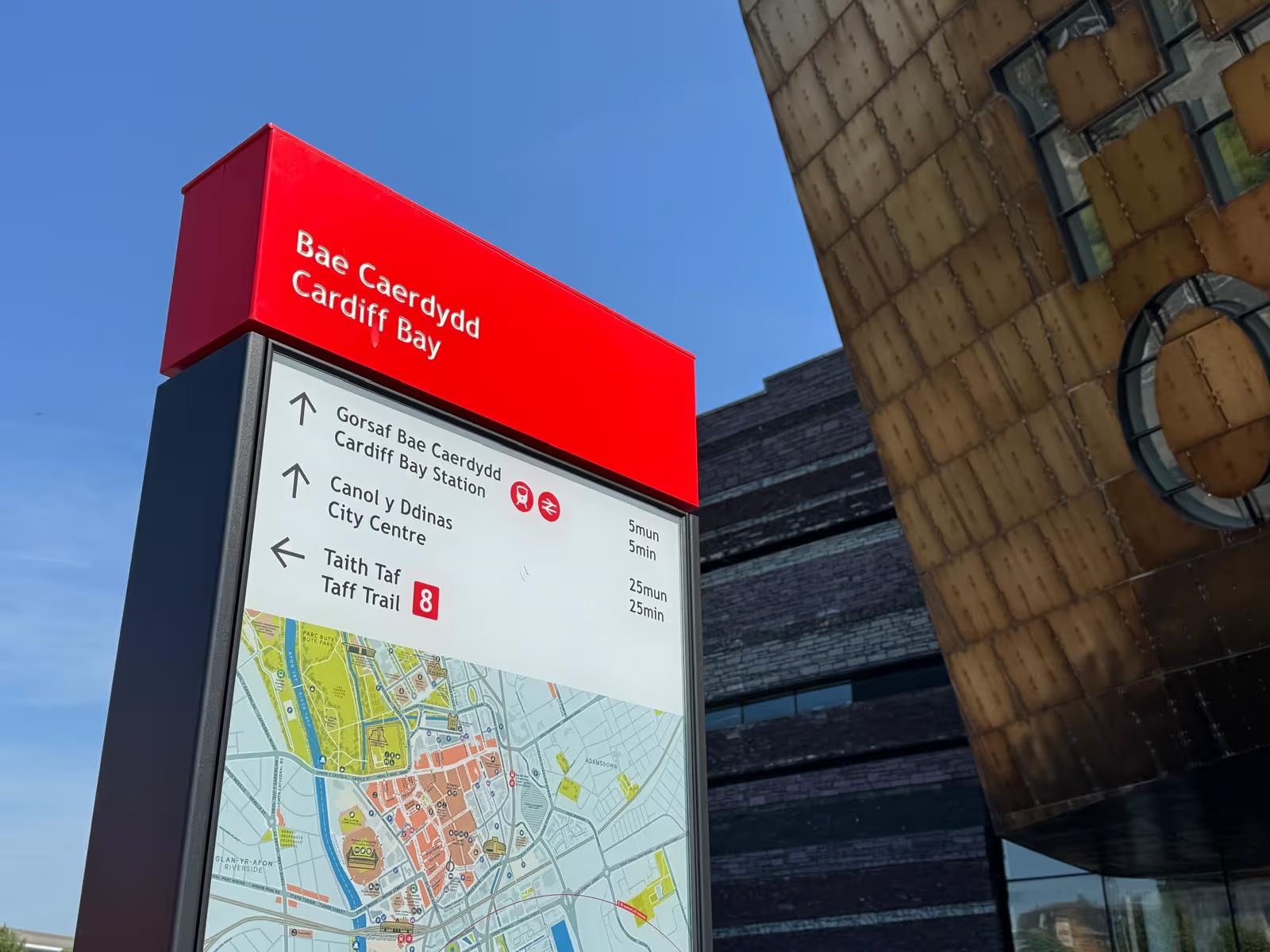
Careful location planning and vision bands are an important aspect of wayfinding in the public realm. The use of a high contrast vision band is especially useful on totem or finger post signs with dark backgrounds, to help users with impaired vision to detect and avoid physical barriers in the public realm that might be blocking block their path.
In Cardiff we placed signs at key decisions points, taking care not to block pedestrian movement, and incorporated red vision bands to give partially-sighted users a high-contrast market that they could spot from a distance.
Signage should make spaces feel calmer and help empower people to move through a space.
Clear, simple words, fonts that are simple to read, and the use of icons where possible can make a huge different to someone with neurodiversity, language diversity or cognitive impairments like dementia to reduce confusion.
Our time at the Neuroplaces Expo has reinforced just how much there is to consider when designing for accessibility, and how much we can continue to learn. It's a challenge we embrace, because even the smallest design decisions can make a huge difference to someone's experience of a place.
As designers, we have a responsibility to consider the diverse needs of everyone who will use the places we help create. That means prioritising consultation with accessibility groups to properly understand the challenges people face and then finding creative ways to overcome them.
Good signage should make navigating a place feel effortless, regardless of a person’s individual needs or abilities. When it works well, people can focus on where they're going and what they're there to do, rather than worrying about how they're going to find their way.
From the smallest icon to the most sophisticated digital wayfinding technology, every design decision is an opportunity to make a place more inclusive and accessible to all.