Our work with the University of Bedfordshire gave us the chance to really let our creative juices flow.
It’s a modern establishment, gaining university status in 1993. It specialises in vocational courses such as business studies, software engineering and sport.
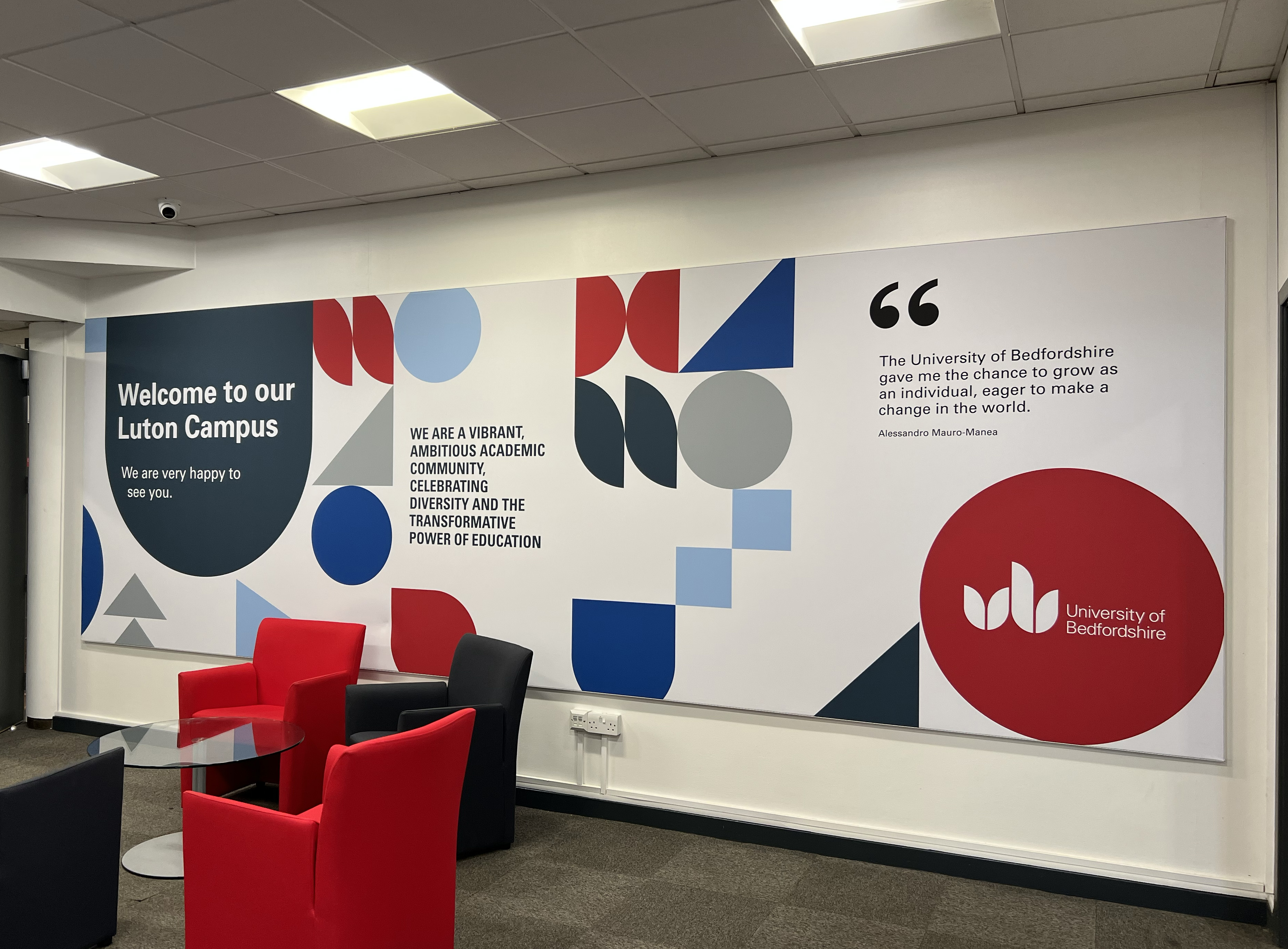
We’ve been working to bring the university’s brand into the spatial environment on its Luton and Bedford campuses in a way that will tie their campuses together and bring a clear sense of place and belonging.
Phase one of the project has focused on creating a series of university-branded welcome spaces within key campus buildings, thinking particularly about how to be inclusive to all users. The branded spaces, now in situ, will encourage students, staff, researchers and visitors to engage with the space and facilitate interactions with each other.
Sophie Campbell, Placemarque’s Creative Director, said:
“We’re taking design codes that we typically develop for public realm in urban areas and thinking about how the psychology of that translates to internal spaces.
“It’s all about creating places for people to engage with each other in an informal way rather than in meeting rooms. It’s the ‘water cooler discussion’ principle.”
The water cooler concept refers to those valuable spontaneous and informal interactions which lead to the ‘cross-fertilisation’ of ideas; opportunities to engage with people from different courses and backgrounds and to come into contact with other ideas and perspectives. It all helps to challenge a student’s own thinking so they grow into more considered individuals; something which the university is keen to encourage.
The branding design here uses a unique combination of colours to demarcate areas through a fusion of geometric shapes. By introducing the new spatial design principles into the built environment, the art underpins the university’s values.
Phase one was implemented as a pilot scheme in April 22. Installed and manufactured by Astra Group. The success of this initial roll out fuelled the expansion and development of the next phase of works.
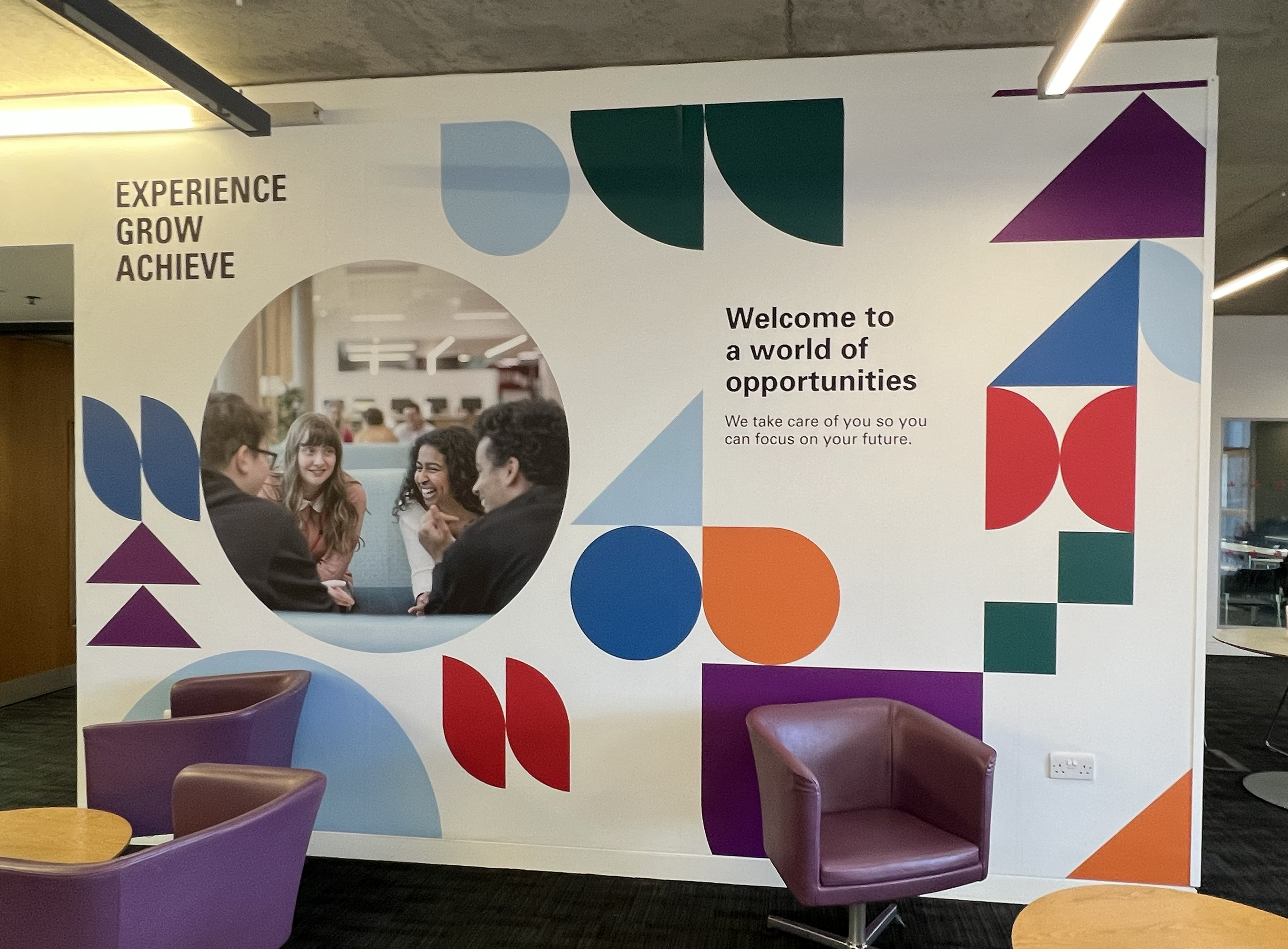
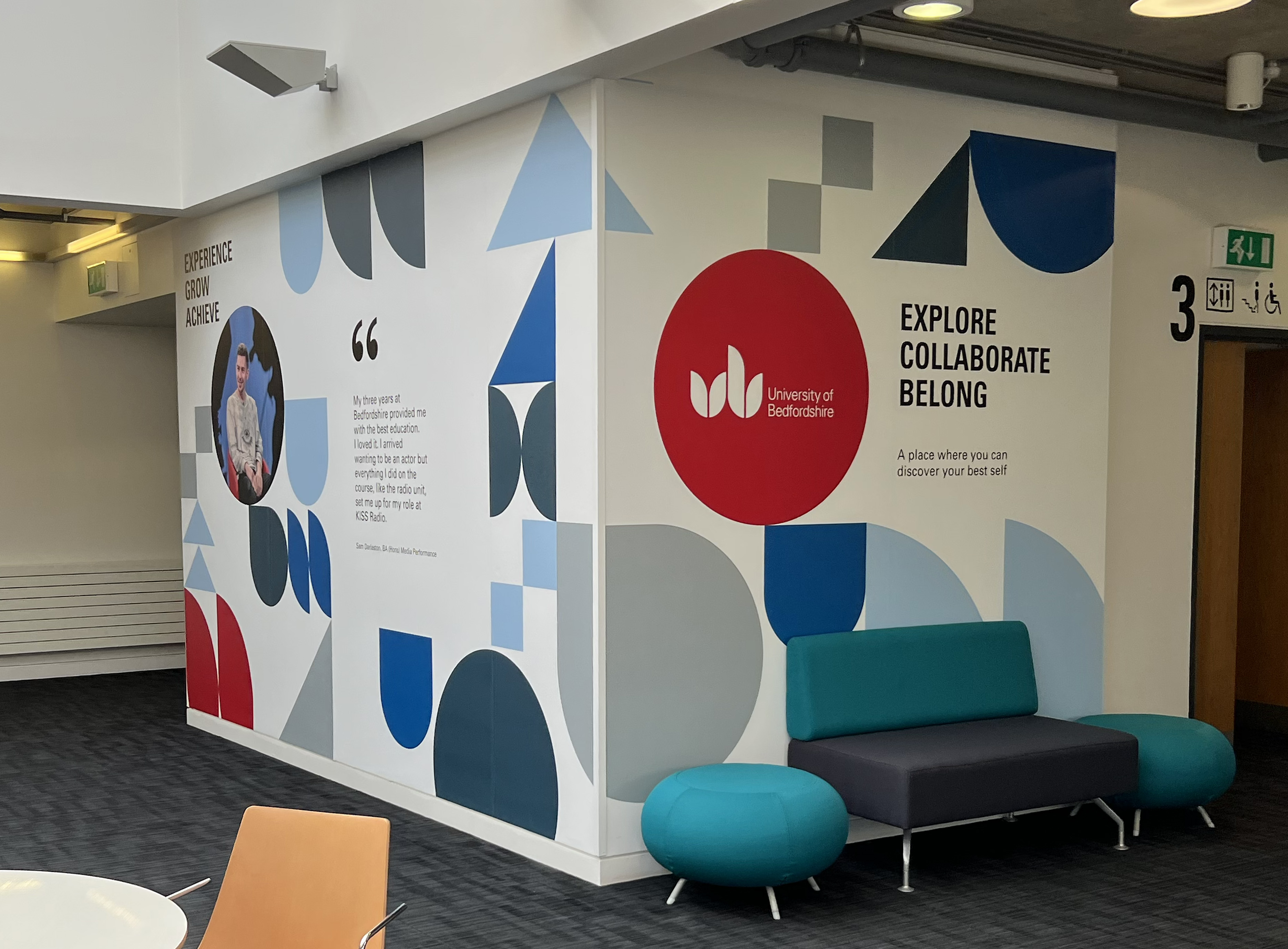
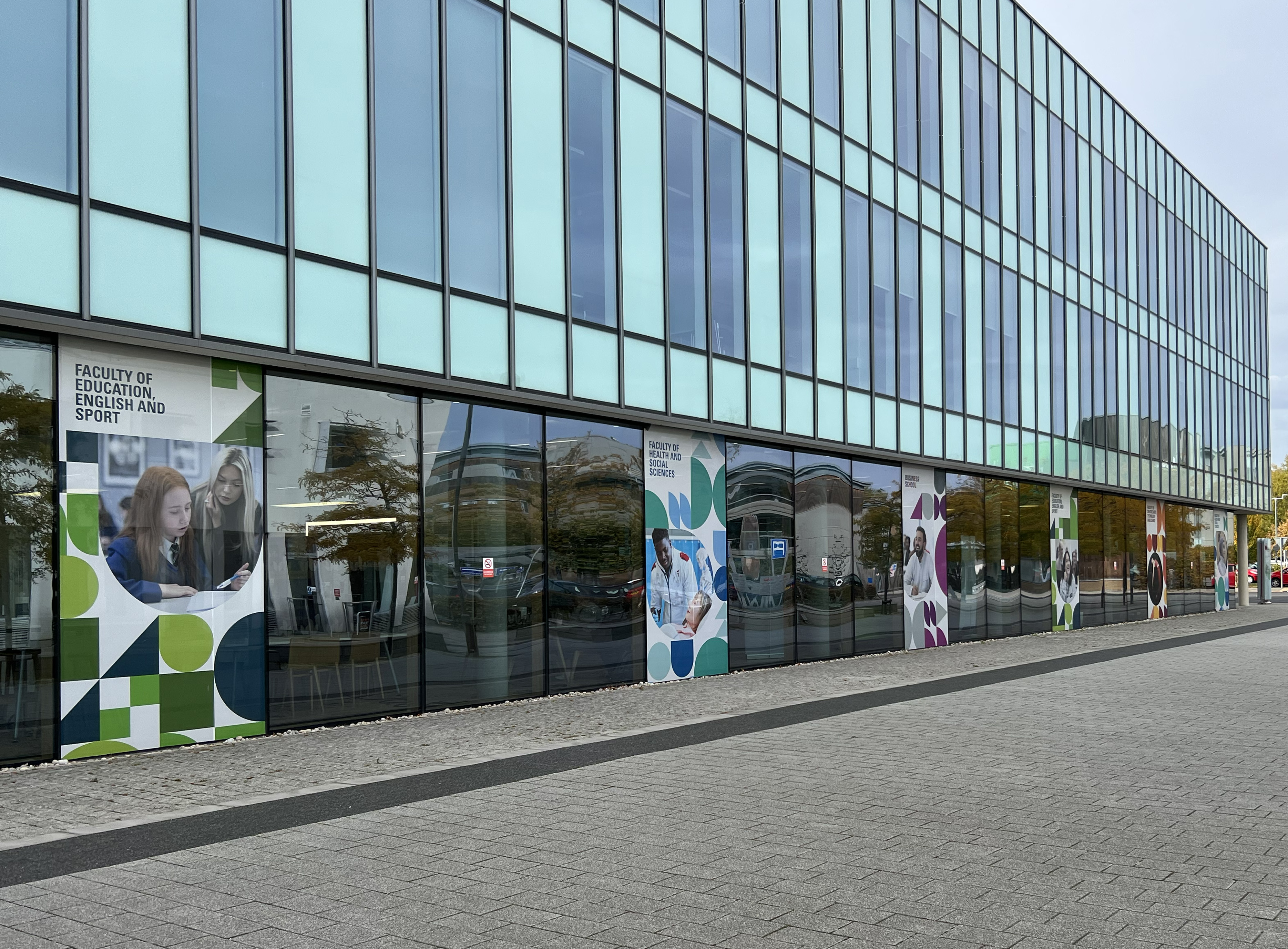
Phase two is now underway, and we’re taking the new spatial branding and flexing it to apply it to different contexts. In phase two we focus on the faculties, using the rationalised colour palettes to create a series of tonal infused spaces that represent each faculty and its department / schools.
We used colour phycology to influence the palettes. For example, the Faculty of Education and Sport uses greens to influence emotions of growth, healing, vitality and endurance. And when you transition into a Business School space you will be met with tones of purples and shades of black to convey wisdom, authority and sophistication.
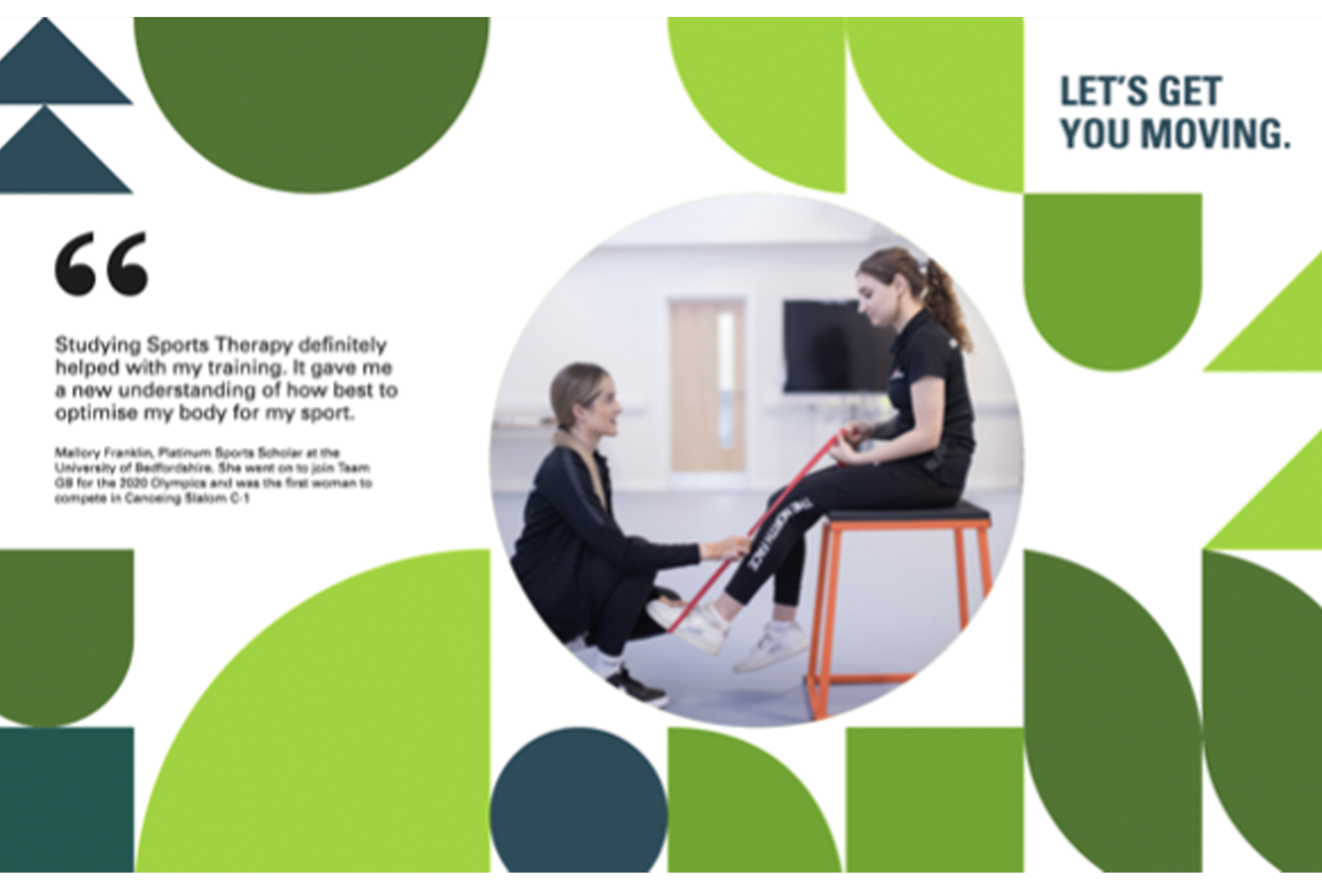

There are four faculties with a distinctive developed colour identity. Within each faculty space we have worked closely with the recruitment, outreach, admissions and marketing team at the university to develop a series of messages that convey each faculty’s voice. This is presented using a combination of alumni quotes, and welcoming, descriptive and engaging messages. We have also utilised the university’s photography bank to excel visual engagement. The consistent use of geometric shapes underpins the university’s values throughout the scheme and creates a cohesion throughout the spaces, buildings and campuses.
The second phase is being manufactured and installed by CSM Live, with the first batch due to be installed before Christmas and the remaining works to be carried out in the earlier part of next year.
We love how the spatial branding is looking in real life and can’t wait to see the next phase be rolled out.