It’s a common experience: walking into an unfamiliar building and feeling overwhelmed by the labyrinth of hallways, rooms and levels. Whether it’s a hospital, university or civic space, these large institutions can be intimidating to navigate.
As wayfinders we don’t just focus on how external spaces work; we also devise wayfinding solutions that can simplify the seeming maze of complex building routes.
So this month we’re taking a closer look at the challenges users face when navigating complex buildings and how an effective wayfinding strategy can make a difference.
Losing sense of direction: why it can be hard to navigate some buildings
Institutional and large-scale commercial buildings will inherently comprise numerous functions and destinations, and with that visitors must tackle multiple entrances, complicated routes and potentially inconsistent levels.
All these aspects make it difficult for visitors (and even occupants) to orient themselves and find their way. There are a number of reasons for this.
Confusing layouts
Internal corridors often lack the orientating landmarks to help users maintain a sense of direction. It’s all too easy to lose track of where you are in relation to a building’s entrance or main meeting points.
Navigating different levels
Stairways and elevators can be challenging to find, and understanding how different levels connect to one another is often not intuitive.
At Eastbourne’s Devonshire Quarter we developed a wayfinding strategy for a row of new and historic cultural destination buildings that are connected internally. The external site has different slopes and levels so you could enter a building on the perceived ground floor and find yourself exiting at a first floor terrace without ever having changed levels. Internal mezzanine levels and lifts that only serve certain floors all add further confusion.
The wrong level of information
Whether it’s inadequate or inconsistent signage as a result of a piecemeal approach, or it’s simply poorly designed, providing the wrong information at the wrong place can further complicate navigation. In some cases, there is simply too much information to process, leading to confusion and frustration. That’s why it’s so important to understand the user’s journey.
Finding your way: the key considerations for a successful internal wayfinding strategy
An internal building wayfinding strategy that provides users with the right information at the right point, in a clear and easily accessible way, is crucial to alleviating navigational challenges.
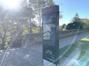
Information in the right place
An effective wayfinding system prioritises the user’s needs and preferences. So, our first task on any project is to audit the building to understand the user journey and obtain stakeholder feedback on perceptions and key destinations.
Only then can we determine where to locate signs to be most useful and, importantly, what information to display and when. Beyond the building entrances it’s also key to identify important “decision-making” points and other intersections between key routes where a person’s sense and confidence in their route might wane.
Manchester Metropolitan University’s notoriously complex science and engineering building boasts several different stair cores but they don’t all provide access to all parts of all levels. Beyond its inherently restrictive design, the building also has certain areas where access is restricted to key cards for safety protocols. It’s enough to confuse even the most directionally-savvy of users.
What was the solution? We worked hard to establish an information hierarchy that displays the right content at the right time in the right way. Our work has been vital in turning an extremely complex navigational challenge into something that any user can understand.
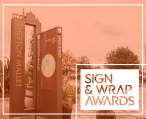
Clear, consistent signage
It should go without saying that all signs should be clear, concise and consistent in design, making them easily recognisable and understandable. We work closely with the client and architect to devise a visual brand that reflects the character of a building or campus. At MMU’s Arts and Humanities building the wayfinding was stylised to marry with the colour detail of the building and its architecture, and at Bruntwood’s Alderley Park bioscience campus we used design cues from the periodic table across all internal signs.
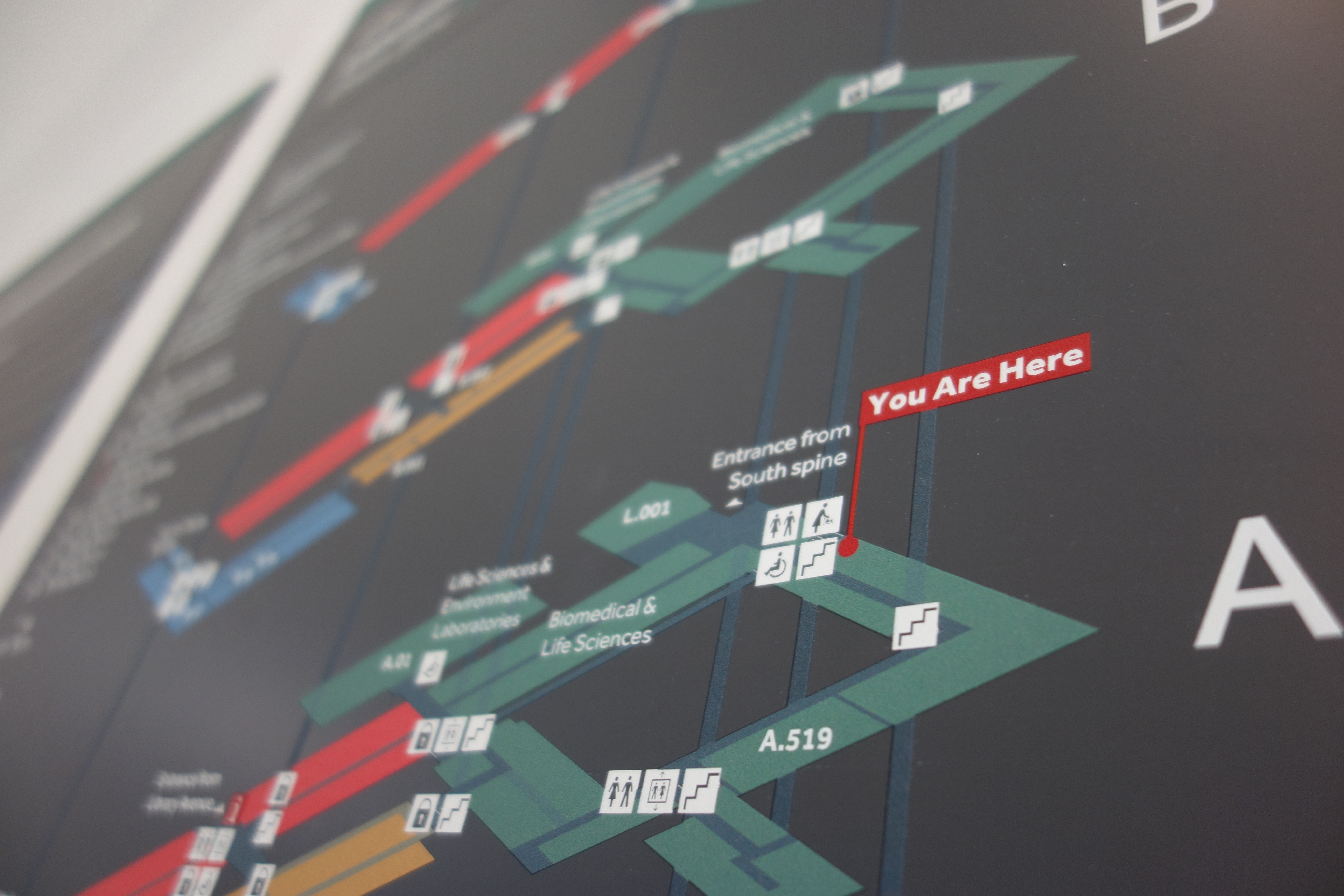
Map graphics must highlight important features (access points, stairways etc) but there’s no shortcut to understanding this: early-stage auditing is critical to properly understanding users’ desire lines and destinations. We always advocate using universally-understood symbols, legible fonts and distinct colours to ensure accessibility for all users, including those with visual impairments or language barriers.
Intuitive signs and design cues
Our graphic input is more than making a sign look attractive and on brand: it’s about helping a user visualise the building layout, find their location quickly and orientate themselves with ease so they can continue on their journey.
Depending on the sign’s positioning, that might mean reorienting the floor plan so that going straight on is always “up” on the graphic.
MMU’s Arts and Humanities building latterly underwent a name change (to Grosvenor East) and the original Grosvenor building renamed Grosvenor West. The buildings adjoin but there’s a half floor level difference between them. The interiors help users to navigate intuitively, with Grosvenor East being very modern and Grosvenor West adopting an interior suited to its listed building status.
Digital and mobile solutions
Digital kiosks, placed strategically throughout a building allow users to access interactive maps and additional information on-demand.
Mobile-accessible mapping systems are becoming increasingly popular because they can offer more control, real-time navigation assistance and customised routes based on the user’s destination.
Giving overwhelmed users the confidence to find their way with ease
Navigating complex buildings can be a daunting task, but an effective internal building wayfinding strategy can make all the difference. By carrying out invaluable early-stage research and then delivering clear, intuitive wayfinding interventions, our approach ensures that visitors can navigate even the most complex building.
Ultimately, a well-designed wayfinding system will enhance user experience, reduce frustration and create a more welcoming environment for all users.
Whether your building is the latest piece of a new masterplan, or it’s been standing for a hundred years, how people move around it is critical. We can help devise a solution that will help your users navigate your building and stay a little longer. Get in touch.