Wayfinding is often about helping people find their way from A to B. But another important aspect is good placemaking, and that requires an understanding of the user’s journey and experience.
Contrary to what you might think, that often means less signs, rather than more. But it still requires careful thought and planning to create good placemaking.
Can you achieve good wayfinding without traditional signs?
Wayfinding for children
Take children, for example. Whilst they’re rarely the ones responsible for finding their way from A to B, their experience of a journey still matters.
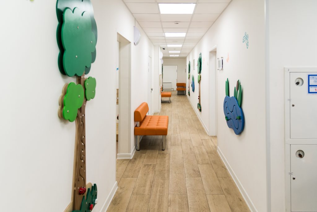
A recent project of ours has highlighted how important a child’s experience of a hospital is: how will they feel taking the long, often convoluted journey from their ward to the Phlebotomy (that’s blood tests to you and I) or X-ray departments?
Wayfinding techniques, like brightly-coloured routes or using engaging graphics to point the way can hugely help a child to feel reassured about their journey. If they’re busy trying to spot where Wally has hidden along the wall ahead, then they’re distracted from feeling anxious about what’s around the corner.
Wayfinding, then, for children is fundamentally about placemaking: enhancing their experience, making it brighter and more inviting, rather than helping them navigate left or right.
Wayfinding for the elderly
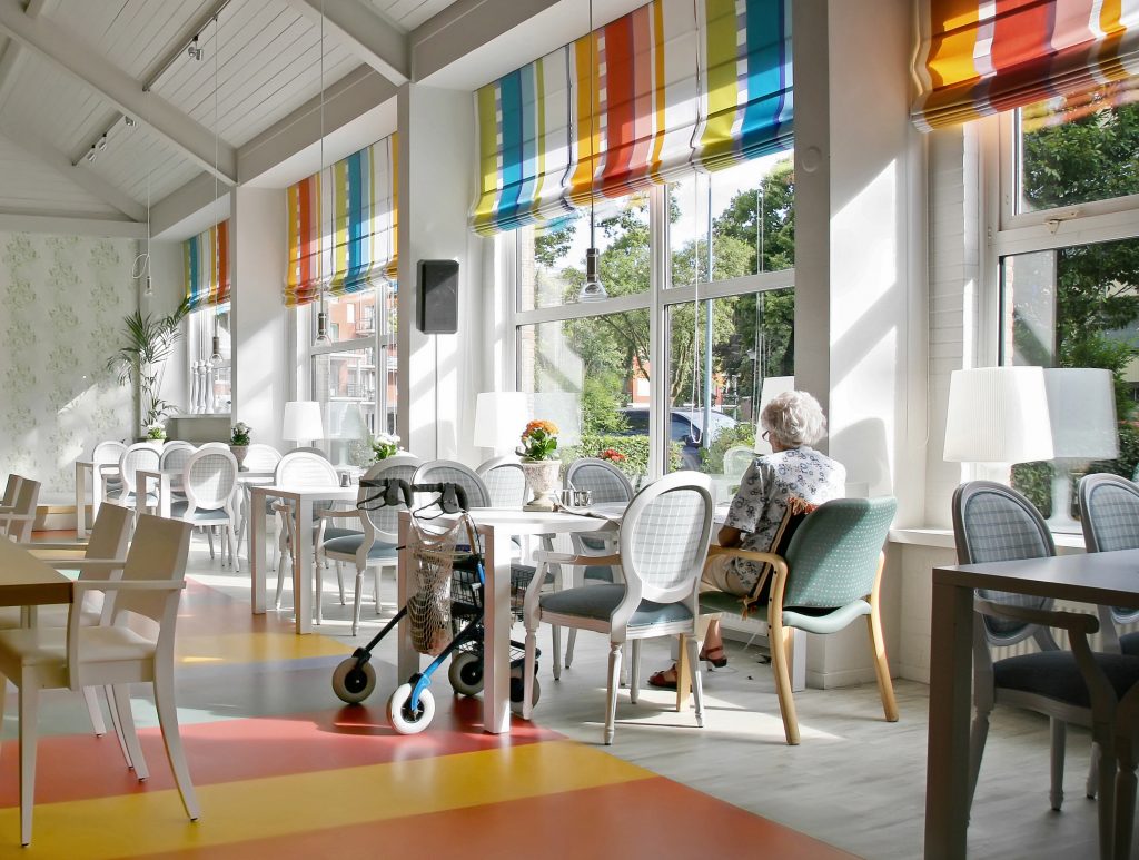
Our work at the Royal British Legion has given us insight into what it might feel like to live in an institution.
Wayfinding in a care home or sheltered community requires a careful approach to avoid it feeling too institutionalised. To retain that homely feel, less really is more. But, some signs are still necessary to help visitors navigate public areas without veering into private spaces. It’s all about getting the right balance.
The trick to good wayfinding in this scenario is firstly devising a strategy that answers the big questions about whether signage is needed or whether other visual clues (like furniture) can negate the need for a sign: the dining room furniture and culinary smells are a better indicator to residents of a care home that they’ve found the dining room.
Once the strategy has identified the places where signs are needed, we take care to choose colours, graphics and fonts that embody a domestic, or even homely feel, to avoid it feeling like an institution.
Wayfinding for the visually impaired
How do you get to your destination easily and safely when you can’t rely on your vision?
The visually impaired will often lean more heavily on their other senses: perhaps it’s the sound of the nearby MOT garage or the smell of the bakery on the corner that helps them maintain their bearings.
And it’s not just those that are blind: too much visual information, like patterns and other visual clutter, can be overwhelming for someone with a cerebral visual impairment.
Simply adding Braille to signs isn’t enough. But, there are plenty of ways that wayfinding can be designed to be fully inclusive for all users.
We incorporate tactile surfaces, like rubber flooring, into our strategies to help guide people to a main entrance, for example. Where appropriate, illumination can to provide a steady contrast on signs that doesn’t rely on fluctuating natural light.
The best spaces explain themselves
When a space doesn’t work well for its users people need extra pointers to complete their journey. That’s why places designed without the user journey in mind often end up needing more signage.
The best spaces explain themselves so you don’t need a sign in the first place.
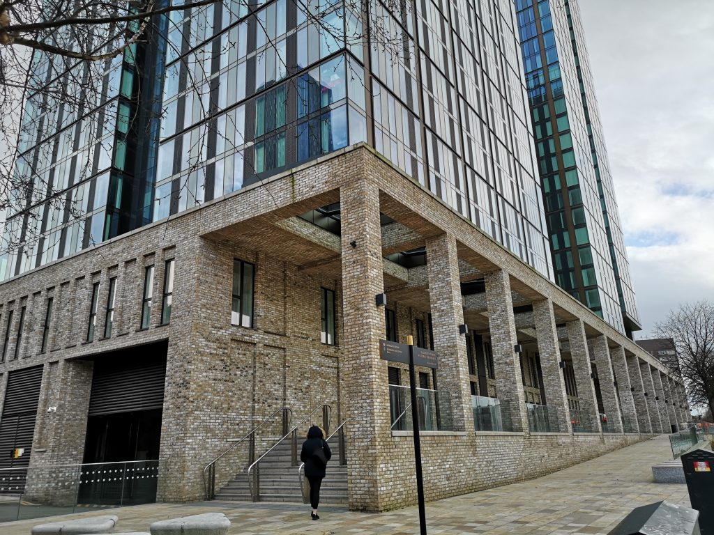
When the wayfinding strategy ties in with an intuitive architectural design you don’t need telling where the main entrance is because it’s clear as day. Just as when you enter a building and you can easily find your next step because it feels logical.
Minimalist wayfinding uses subtle cues to gently guide the user onto the next step in their journey.

At UCL Pearl, the building successfully explains itself. There’s a clear hierarchy of space and it’s obvious where the entrance is because the wayfinding interventions in the public realm – coloured running track pathways – guide you to it. This scheme used very few directional signs externally because the landscape scheme does the job. And internally, the subtle use of wayfinding reinforces, rather than corrects, your instincts. For us, UCL Pearl is the ultimate example of how good design and good wayfinding can combine to create a well functioning, efficient and welcoming place.
We won’t suggest signs where signs aren’t needed. And when architecture, landscape architecture and wayfinding work together from the outset, you can achieve clear and logical wayfinding without the need for endless signs.
If you’re looking to incorporate wayfinding into your next public realm project, we’d love to work with you.
