From 2D design to 3D sign
In the realm of wayfinding design, the transformation of a two-dimensional branding concept into a functional, beautiful three-dimensional sign is an art form in itself.
It’s a process that not only involves a keen understanding of branding and design but also an understanding of people movement and information communication.
This art is our bread and butter.
We thrive off creating signs that are not just merely navigational aids but storytelling elements that resonate with a place and its history.
Signs at the intersection of branding and placemaking
Branding and placemaking, though intertwined, serve distinct purposes. Place branding is often driven by commercial objectives, aiming to revitalise or redefine a space as part of a wider redevelopment or to attract attention and engagement. It’s a process of reinvention, often accompanied by a complete overhaul of the previous identity.
Placemaking, on the other hand, is about understanding a place and its story, and then making that shine. A branding project may still be involved, but it’s more about revealing the story of a place rather than giving it an identity make over.
Both are important but it’s key to understand a project’s overall objectives to make sure you implement the right the wayfinding solution.

From 2D design to 3D sign
Of course, signs must stand the test of time physically as well as conceptually.
Our diverse expertise includes 3D design, where we bring a practical understanding of materials and manufacturing to determine the right choice for any given location.
We take care to choose the right material, not just on aesthetics but on how it will withstand the local environment. At coastal locations, for example, we favour self-finishing materials like galvanised metal over timber, which will age more quickly.
Tom Cookson, 3D Designer
We help our clients visualise how a graphic device might translate to a real-life object and look in the streetscene, and ensure it withstands all that life (and the Great British weather) will throw at it.
Our site visits are important for discerning the right scale for our signs: larger totems will hold their own in high density cityscapes but would look oversized in smaller settlements. Using montages and renders also helps to visualise how signs will look in situ.
Tom Cookson, 3D Designer
One key challenge when converting a brand into signage is how to retain legibility and accessibility particularly as brand designs aren’t created with navigation in mind. The problem is, no matter how much a font aligns with a brand personality, if it’s not easily legible it won’t help people find their way. Likewise colour contrasts can often be less-than-accessible for people with visual impairments. Our role is to work with brand designers to flag up potential issues to help improve legibility and accessibility.
Getting signs in the ground
Take a look at these examples where we took branding guidelines as the starting point for a practical and workable wayfinding solution.
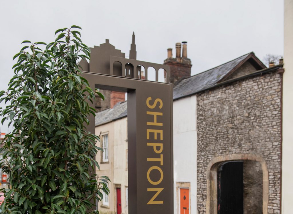
Blending boldness with accessibility in Shepton Mallet
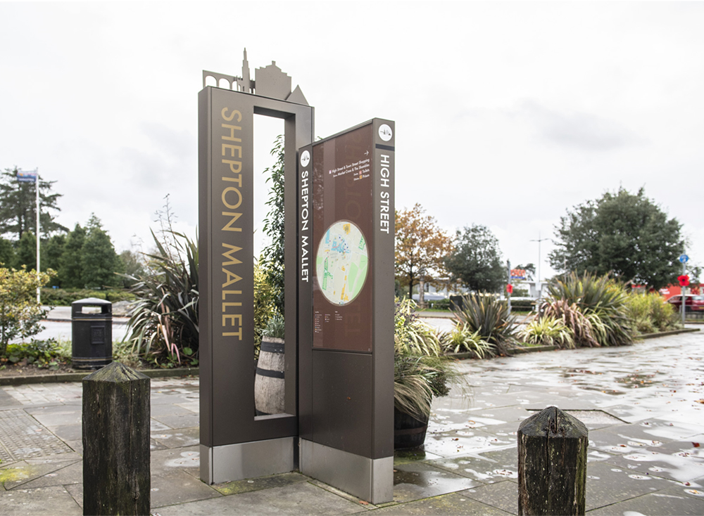
The wayfinding challenge here drawing visitors away from the edge-of-centre retail park and into the town centre. Inspired by the town’s personality – defined in its brand guidelines as “warm, quirky, hopeful and bold” – we sought to create a “bold and quirky” wayfinding solution using the brand colours to catch the attention of passers-by.
We broke the brand up into 3D elements, reinforcing the personality and story of Shepton Mallet. We chose a bronze background colour for the powder-coated sign structure to create an eye-catching colour contrast with a colourful 3D cut-out feature.
Signs placed strategically at each end of the high street feature generous apertures give passers-by a glimpse of the high street. Signs also feature maps and directional cues not only guide but to intrigue, inviting exploration and interaction.
Overcoming physical constraints with innovation in Broadgate, London
A dynamic graphic device within Broadgate’s brand guidelines, extrapolated from the letter “B”, was our muse for this one.
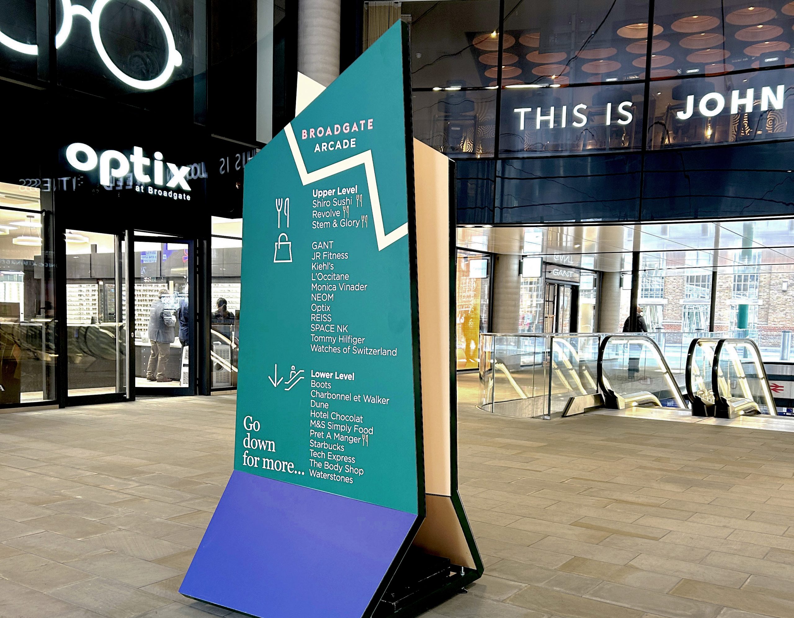
It inspired our response to the unique challenges of the dense urban setting, in particular high wind loading (due to the high rise built form and relatively narrow streets) and uneven surfaces.
Using lightweight materials, concrete bases and adjustable feet, we devised a temporary sign solution that sticks faithfully to the brand identity while addressing crucial practicalities in situ.
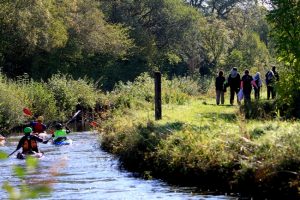
Guiding visitors through time and space in Ireland’s Ancient East
This project was a deep dive into Ireland’s past. Inspired by the brand logo – a spiral known as the Hill of Tara – our signs narrated the rich history of Ireland’s Ancient East region.
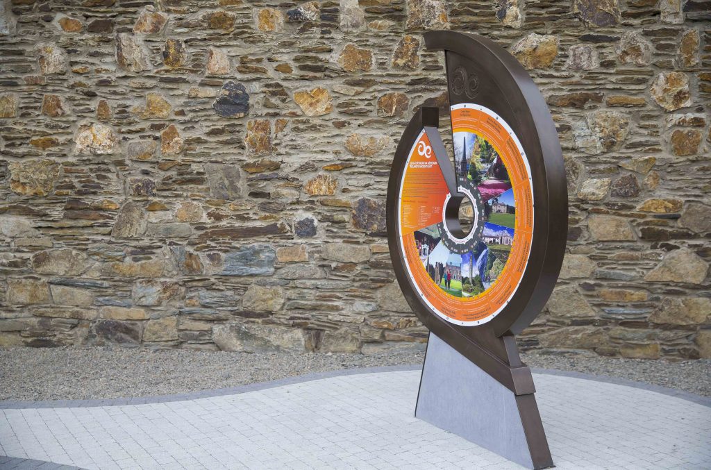
The purpose of the project was to cross-sell destinations, so that visitors at the popular honeypot sites would be encouraged to venture out and explore places within an hour’s journey from the centre.
We took the logo and used it as a device for the structure of the sign itself. Then we mapped out destinations around the spiral – with the honeypot in the centre and the lesser-known peripheral places around the spiral.
These signs were not just informational; they were an invitation to explore beyond the well-trodden paths, guiding visitors on a journey through time. Combining the brand logo and the site to create a unique object was a bold step but it paid off – our Ancient East project is multi-award winning.
The Hidden Magic of 3D Signage
The true magic lies in understanding the core of a brand and its objectives. Through our creative process we convert graphic elements into tangible, three-dimensional forms that not only serve their functional purpose but also help tell a place’s story. This transformation from a flat design to an interactive, engaging structure is what we love doing best.
The essence of successful wayfinding design lies in its ability to tell a story. It’s about understanding the brand and translating its aspirations into the physical world in a way that resonates with people. Our journey with each project is an exploration of creativity, functionality and storytelling, ensuring that every sign we create is not just a direction marker but part of the place’s ongoing story.
If you need help translating your place’s brand and identity into a coherent wayfinding strategy that reinforces your brand, get in touch on 0161 241 3174.